Noah Pan

Behavioral product design, measured in a 12-month utility pilot

PeakEnergy

The Ontario Energy Board wanted to learn whether better information could help households respond to electricity prices. I led the mobile experience around 2 personalized definitions of normal: days like this one and households like yours. During summer critical-peak events, digitally engaged participants achieved nearly 5 times the reduction of non-engaged participants on the same rate plan.

Role

UX Lead

Client

OEB × Oshawa Power

Agency

Publicis Sapient

Platform

iOS & Android

When

May 2018–April 2019

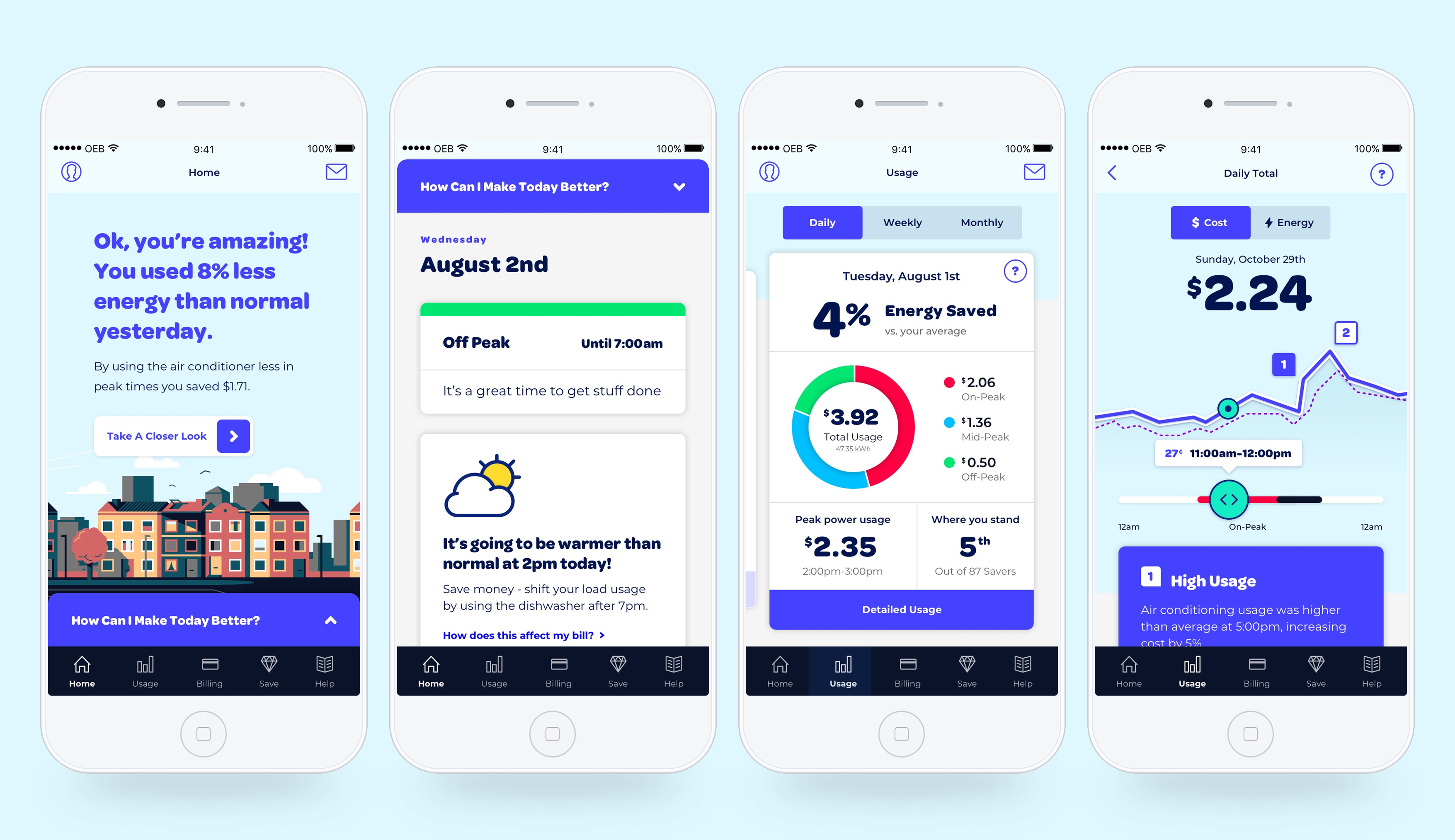
Peak Energy mobile app screens showing a personalized result, daily coaching, usage comparison, and detailed peak-time explanation

Yesterday’s result · Why it happened · What to do today Oshawa, Ontario · 12-month pilot

1

A pricing pilot also tested what better information could change.

Time-of-use rates already charged more during peak periods, but price alone had not produced enough conservation or load shifting. The OEB set a goal of reducing peak-period use by 4% to 6%, helping households manage their costs while improving system efficiency.

The rate schedule follows demand across the grid

This illustration shows a winter weekday. On-peak rates covered the morning and early evening, while overnight use cost less. In summer, the on-peak window moved to midday, when air conditioning placed more demand on the system. A household’s own busiest period did not necessarily match the grid’s, so the product had to make both timing and consequence understandable.

The 12-month pilot included roughly 2,000 Oshawa Power households across 3 treatment groups. One retained standard time-of-use pricing, while 2 tested stronger price incentives.

Every group could choose to use the Peak mobile app and other digital communications. The rate plans were the controlled treatments; digital engagement was observed within each group.

One digital product across all 3 groups

Peak translated rates and household energy data into personalized explanations, recommendations, and notifications. The final report compared participants who engaged with these digital tools against non-engaged participants within the same rate treatment.

Standard rates

Information Only

Existing time-of-use pricing, with access to Peak and the pilot’s communication channels.

Alternative rate

Seasonal TOU + CPP

A wider spread between lower- and higher-cost hours, plus critical-peak event pricing.

Alternative rate

Super-Peak TOU

The pilot’s strongest price incentive, concentrated into a narrower high-cost period.

2

Usage data could show what happened. It could not tell people whether it was good.

Utility products commonly presented kilowatt-hours, rate periods, and historical charts. Interpreting those numbers still required a household to understand whether the weather, the home, or a change in behavior made the result unusually high or low.

We reviewed utility experiences and products in fitness, finance, and nutrition, then worked through the implications with Oshawa Power stakeholders and an energy subject-matter expert. That clarified 3 requirements: a personal baseline, a relevant peer comparison, and a clearer next action.

A baseline that changed with the day

A heat wave should not be compared with an ordinary Tuesday or the same calendar date last year.

A comparison that fit the household

A city-wide average says little about a particular home and is easy to dismiss.

An action timed to the next opportunity

Historical charts matter only when they help someone make a better decision today.

The model I introduced

“Normal” needed 2 definitions.

I structured the app around 2 questions that ordinary utility data could not answer. “How am I doing against my own normal?” required a comparison with relevant days from that household’s history. “How am I doing against households like mine?” required a personalized peer group. Machine learning generated both comparisons dynamically rather than relying on fixed calendar periods or broad geographic averages.

1Your own normal

Similar conditions, regardless of the calendar

An ML model selected past days with comparable conditions, including weather, for that specific household. The result showed whether today was genuinely better or worse than a relevant part of its own history.

Product question How did I do compared with days like this one?

2Your cohort

A peer group generated for your household

A separate ML model formed a cohort of comparable households. Peer standing could then feel relevant enough to guide behavior instead of functioning as a generic city average.

Product question How am I doing compared with households like mine?

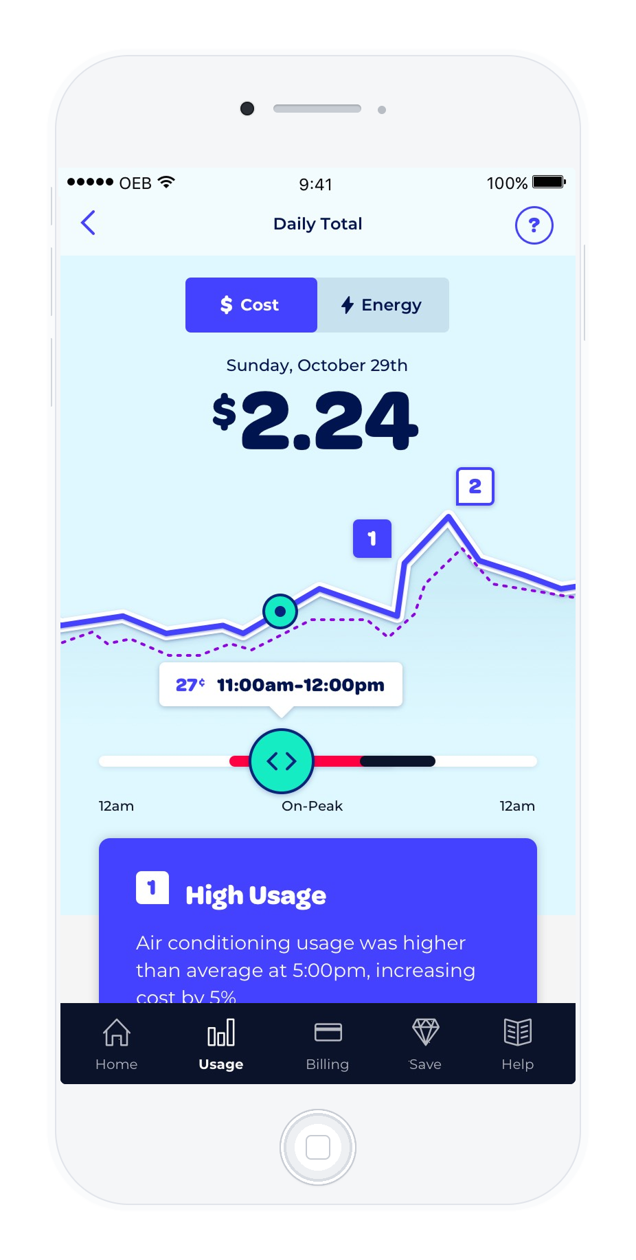
Daily Total detail showing the day’s cost against a personalized benchmark and a high-usage explanation connected to air conditioning at 5pm

Personal baseline

A benchmark generated for this household and this day

The dashed line represents a dynamically selected set of similar days from the household’s own history. Moving above it means usage exceeded what comparable conditions would predict.

Explanation

Connect the result to a specific moment

Appliance disaggregation helped identify likely sources of a spike and translate them into an understandable cost consequence.

3

Delayed meter data became useful before the next peak.

Oshawa Power could deliver household usage after the day ended, so a real-time dashboard was impossible. I organized the experience around a different rhythm: explain yesterday clearly, then use today’s conditions to surface the next opportunity.

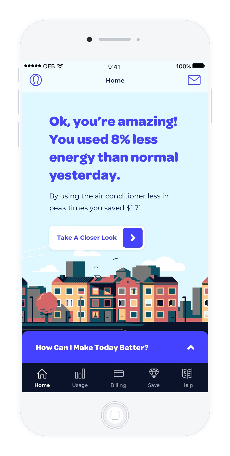
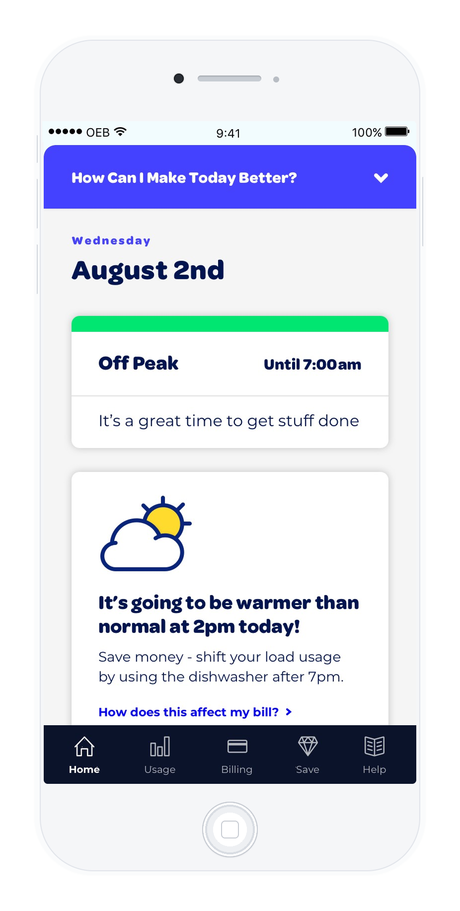
The home screen led with a verdict rather than a kilowatt-hour total. From there, a household could understand why the result changed and see a concrete action timed to today’s rates and weather.

Peak Energy home screen explaining that the household used 8% less energy than normal yesterday and saved $1.71 by using less air conditioning during peak hours

Yesterday’s verdict

Lead with what the data means

“You used 8% less energy than normal” answers the household’s first question immediately. The app then connects that result to a behavior and dollar amount.

Today’s opportunity

Use the forecast to make delayed data actionable

Weather-aware guidance points to a specific shift, such as running the dishwasher after 7pm, before the next costly period arrives.

One connected loop

Result Home screen presenting yesterday’s personalized energy result and dollar savings
How did I do?
Explanation Detailed usage screen connecting a peak in cost to air conditioning use at 5pm
Why did it happen?
Next action Today screen using the weather forecast and rate period to recommend running the dishwasher after 7pm
What should I do today?
4

The app tested appliance-level insight without treating every inference as fact.

Better disaggregation was part of the experiment

The pilot tested whether machine learning could identify likely appliance-level causes from household energy patterns without requiring a sub-meter on every device.

Use specific explanations when the model produced a useful signal.

The household could complete the picture

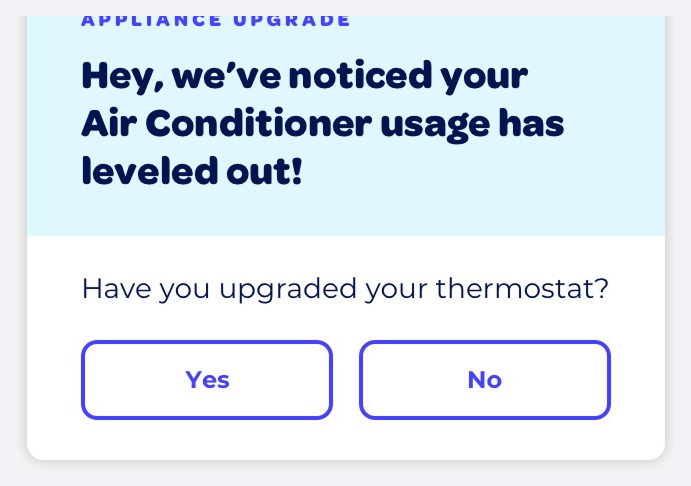
When a change in usage might have another explanation, the experience could ask the household to confirm what changed.

Treat confirmation as product input, not as a correction buried in settings.

Peak Energy asking whether the household upgraded its thermostat after air-conditioner usage leveled out
The model detected a pattern; the household supplied the missing context.
5

I led the experience model and developed it with a multidisciplinary team.

As UX Lead, I defined the app’s structure and the 2 personalized comparisons at its center. I worked closely with a junior UX designer to develop the interaction details, which made this a particularly rewarding project to lead hands-on.

My responsibility

Product model and experience direction

I owned the information architecture, core interaction model, similar-day comparison, cohort comparison, and the daily loop connecting result, explanation, and action.

Design collaboration

Working through the details together

The junior UX designer and I collaborated closely on how the model should behave across individual screens, states, and longer-term usage.

Visual direction and voice

A distinct alternative to utility software

The art director and creative director led the visual expression, with my input on direction. A senior copywriter shaped the encouraging product voice.

Domain and delivery

Energy expertise connected to implementation

An energy subject-matter expert guided the domain logic, while full-stack developers built the experience. Oshawa Power stakeholders reviewed the work throughout.

Validation

Oshawa Power stakeholders reviewed the product model throughout, and the energy SME guided domain decisions. The 12-month live pilot then provided field evidence through adoption, support patterns, and measured electricity use.

The final report concluded that the pilot’s digital tools helped achieve up to 5 times more conservation than the 2 alternative price treatments alone.

OEB × Oshawa Power · RPP Pilot final results report · 2020

Outcome

The strongest reduction appeared during the hours that mattered most.

Digitally engaged participants consistently performed better than non-engaged participants within the same Seasonal TOU + CPP treatment. The gap was largest during summer critical-peak events.

The final report defines digitally engaged participants as people who used the app, web portal, or registered messaging. I led the mobile app, which was actively used by more than 80% of participants in the pilot’s opt-in groups. The web portal saw very little use.

Winter on-peak

−2%

Engaged participants reduced use 2%, while non-engaged participants increased use 3%.

Summer on-peak

−6%

Engaged participants reduced use 6%, while non-engaged participants increased use 5%.

2× the 6% goal

Summer critical peak

−12.8%

A 12.84% reduction, nearly 5 times the 2.64% reduction among non-engaged participants on the same rate plan.

In the Super-Peak treatment, only digitally engaged participants reduced their usage. Engagement was voluntary and the final report grouped several digital channels together, so the pilot does not isolate the effect of the mobile app alone. It does provide unusually strong real-world evidence that personalized feedback and timely communication helped households respond to electricity pricing.

Across the 12-month pilot, participants requested help for lost logins and technical problems, but not for understanding the features or energy-saving strategies.
Next Project

Vehicle Finder

Ford Motor Company