The Tension
Find vs. Build
Buy from nearby inventory now, or custom-order from the factory and wait. No single experience helped buyers navigate both.
Guided vehicle-buying for surging EV demand
Record demand for Ford's new EVs met empty dealer lots, and the only alternative was a factory order with a long, uncertain wait. I led UX for Vehicle Finder, a single tool that let shoppers configure the car they wanted, watch real local inventory respond to every choice, and decide between buying nearby and building to order with the trade-offs in plain view.
The 60-second version
When record demand for Ford's new electric vehicles collided with severe production shortages, the standard car-buying journey broke down. Customers who wanted an EV found that local lots were empty.
The only alternative was placing a custom factory order, an extended wait with limited visibility. The problem wasn't just supply; it was that Ford's digital experience forced customers to mentally reconcile these two separate realities on their own.
The Tension
Find vs. Build
Buy from nearby inventory now, or custom-order from the factory and wait. No single experience helped buyers navigate both.
The Mandate
One view
Ford needed a single digital tool to surface both paths, surface real trade-offs, and move buyers from exploration to a confident decision.
Before exploring interface directions, we wrote a precise product definition with Ford's team: who the tool serves, the confidence it has to create, and what it deliberately is not. Every design decision that followed had to pass this test.
Phase 01
Understanding the product requirements, the competitive landscape, and where outside-category inspiration could unlock the right design direction.
Discovery ran across three parallel workstreams. Rather than jumping straight into solutions, we needed to understand the technical realities, benchmark against the industry, and look entirely outside automotive for inspiration.
Embedding with the Ford Vehicle Finder product owner and their developers to draft feature stories together, so requirements, constraints, and the desired experience were shaped with the people building it rather than handed over in a document.
Auditing the full landscape of automotive digital purchase tools (OEM configurators, dealer inventory systems, and third-party marketplaces) to benchmark against industry leaders and identify best practices.
Studying guided customization far from automotive, in eyewear, toys, and food ordering, where live availability and high-consideration choices had already been designed well at scale.
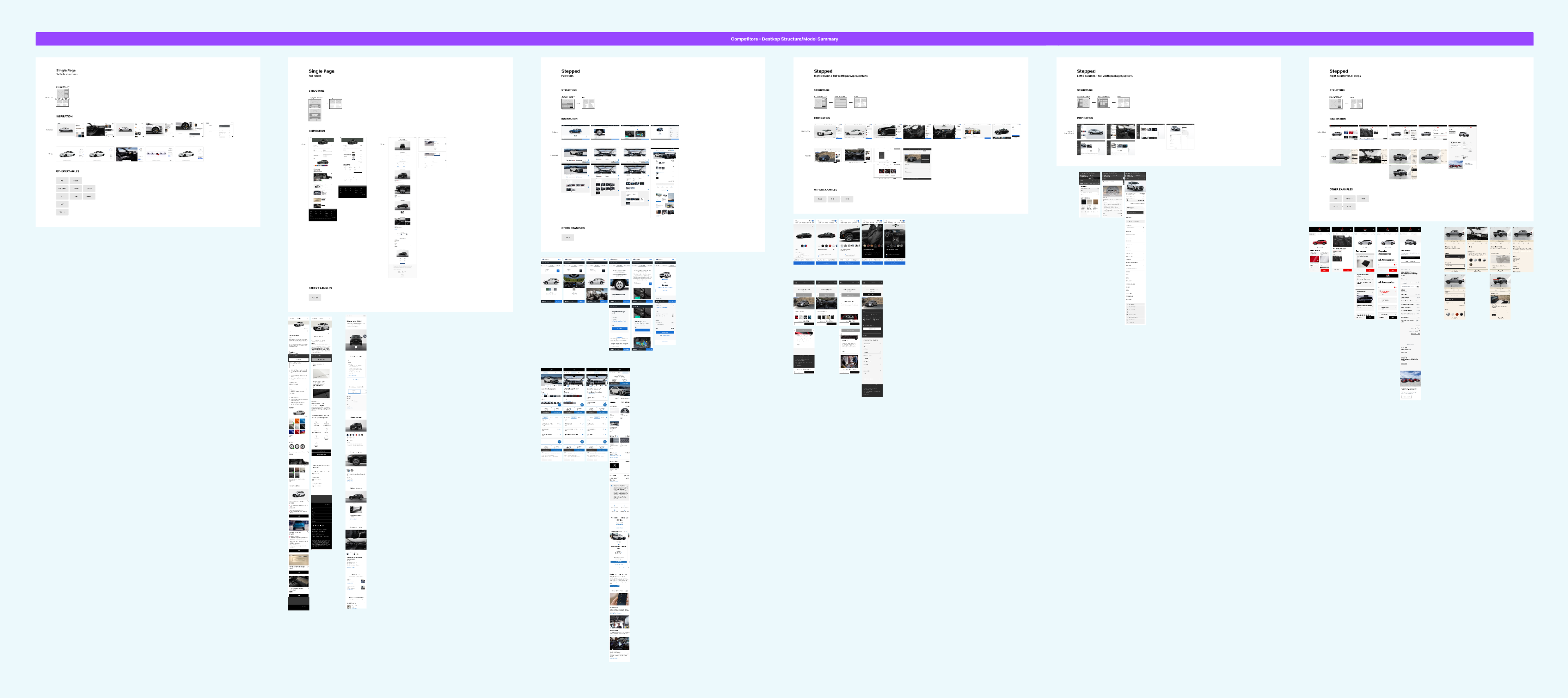
We conducted a comprehensive audit of the digital car-buying landscape, from OEM build-and-price tools to dealer inventory search to third-party marketplaces. Screenshots were catalogued, annotated, and mapped against the key user jobs they did (and didn't) support.
A consistent gap emerged across every competitor: none handled the tension between 'build your perfect car' and 'see what's actually near you' in a single coherent view. Customers were expected to context-switch between separate tools and make sense of the gap themselves. Most couldn't, and didn't.
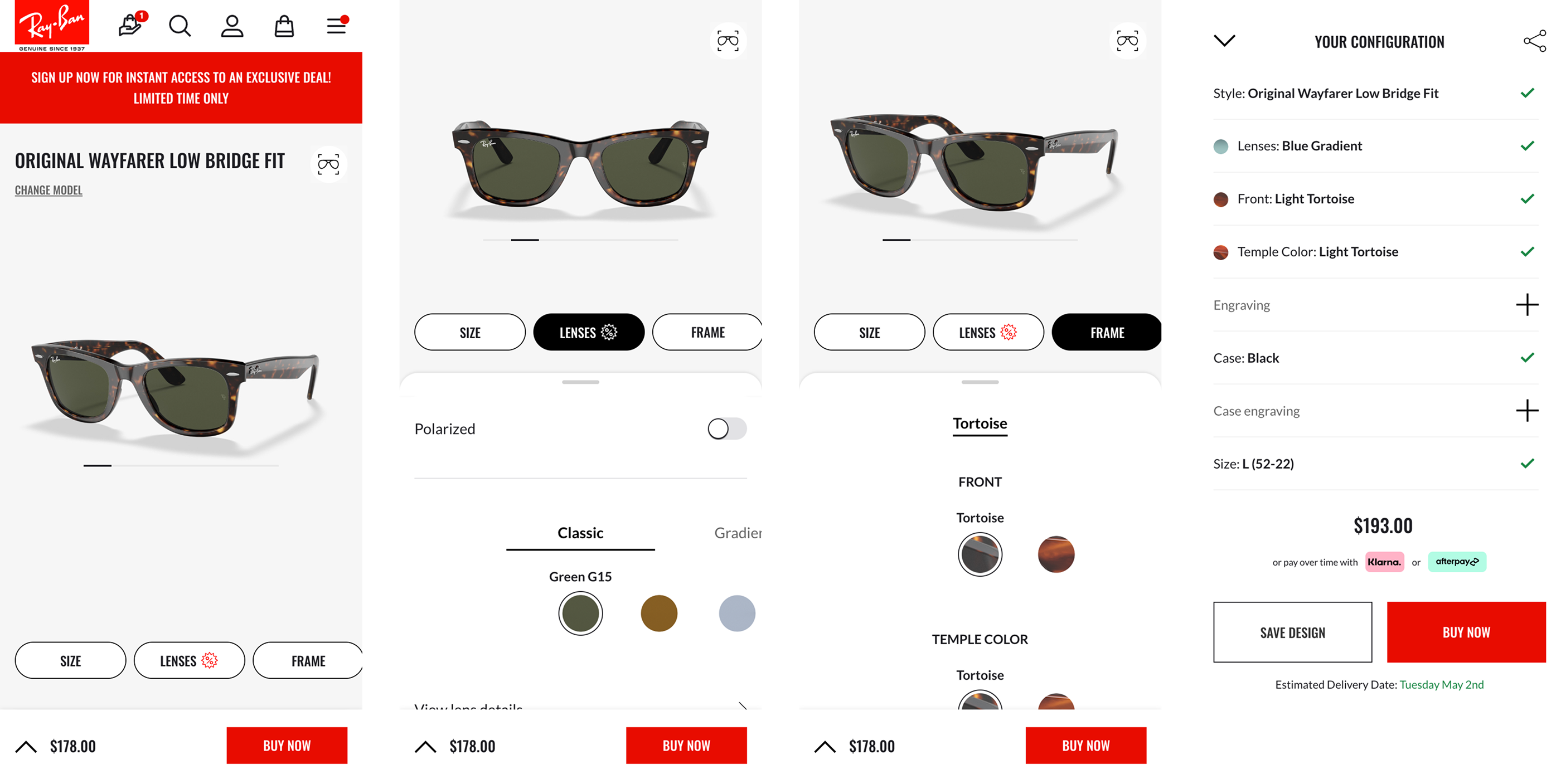
The best guided configurator experiences weren't selling cars. We deliberately looked outside the category to industries where complex customization, live inventory feedback, and high-value commitments had already been solved at scale.
As users selected frame shape, color, and lens options, available variants updated in real time, with no dead-ends and no 'sorry, that's not in stock' after committing to a build. The constraint became part of the design.
A doll builder for a high-consideration purchase. Each step deliberate, richly visual, with clear confirmation of what had been selected before moving on. The emotional weight of the decision was reflected in the design's patience.
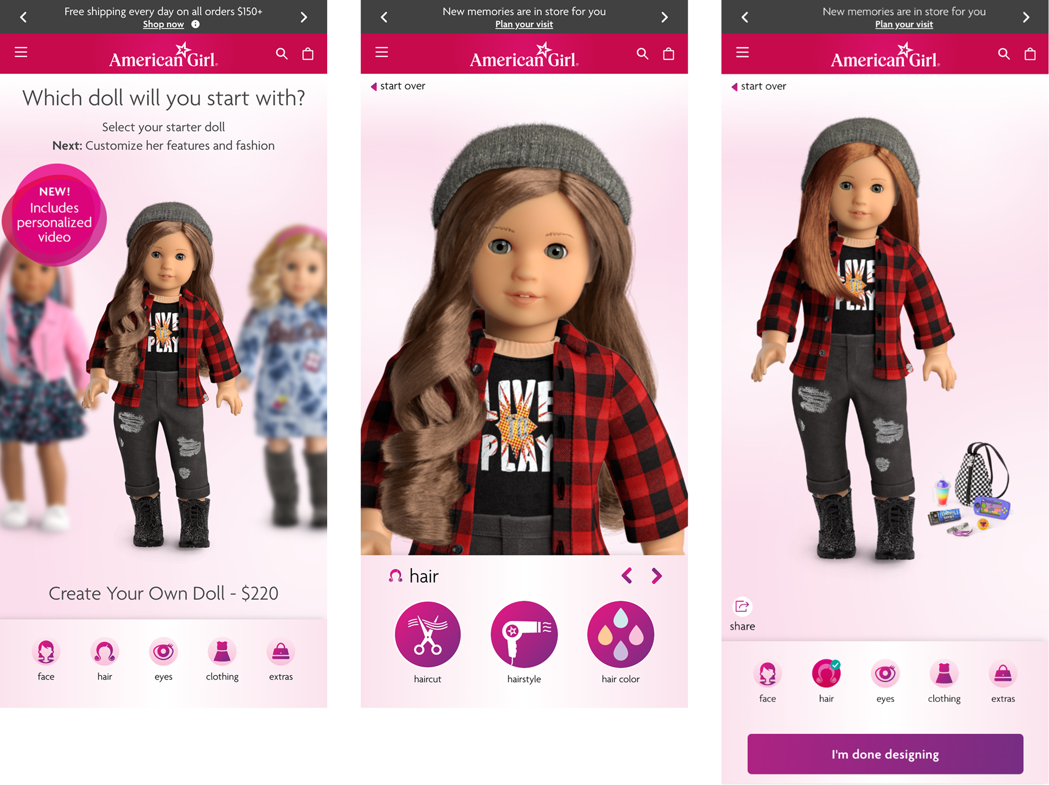
The cleanest expression of progressive commitment we found: each selection narrows what remains and builds toward an obvious conclusion, while the running summary keeps everything already decided in view.
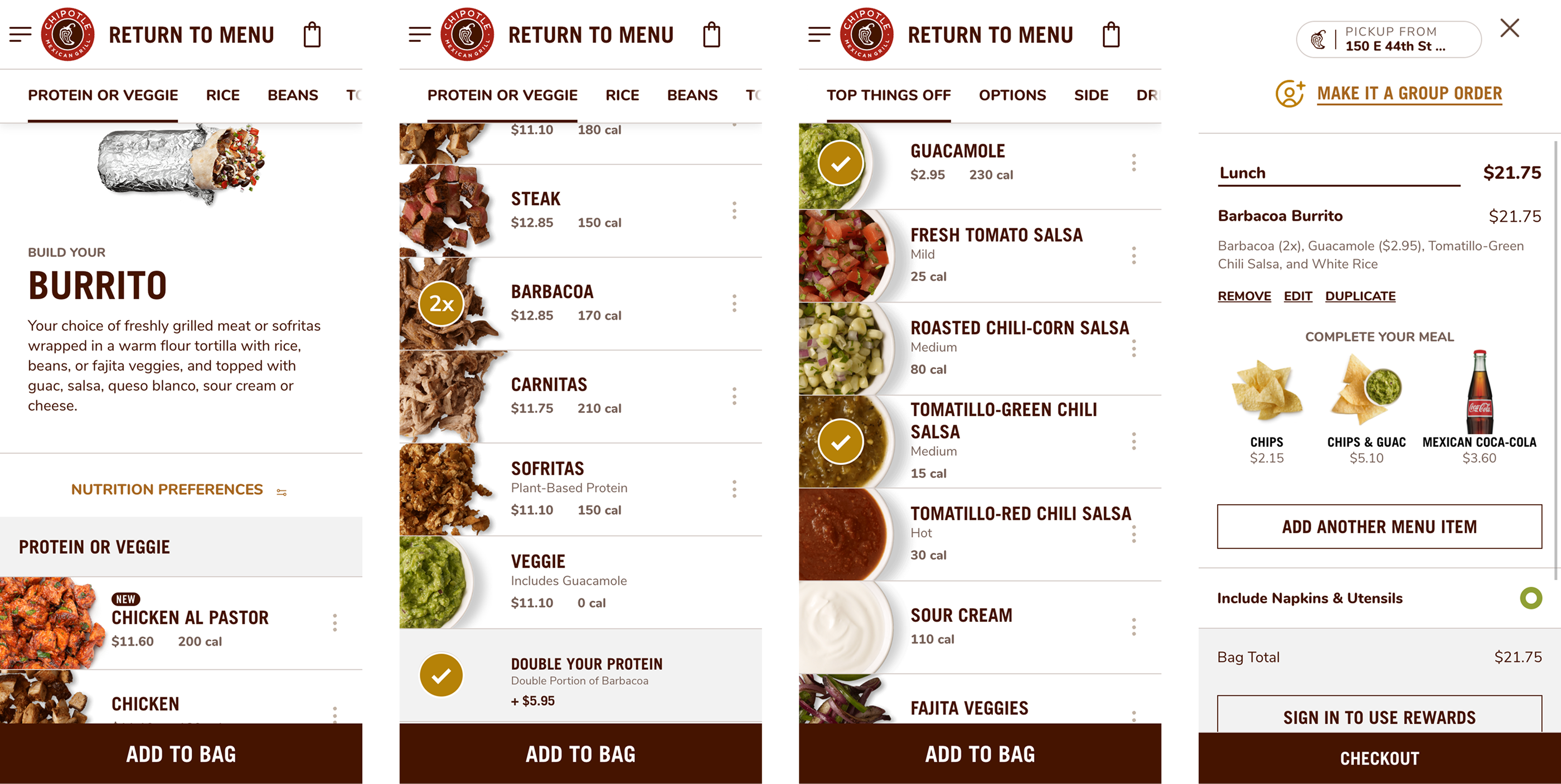
The pattern across all three: progressive commitment. Users make selections in a clear sequence, see the real consequences (availability, price, options) at each step, and arrive at a summary with full confidence. That became the through-line for Vehicle Finder.
Phase 02
Developing and comparing structural approaches to the experience, from high-level architecture to the interaction model that would define the configurator.
Rather than building a new tool from scratch, the strategic challenge was bridging Ford's existing build-and-price configurator with its separate inventory search. We developed three high-level approaches to evaluate the interaction model before locking in a direction.
Build a configuration experience that dynamically updates available inventory as the user makes selections, with inventory surfaced either as an overlay (1a) or a dedicated side view (1b). Existing inventory search tool remains separate downstream.
A unified experience that combines inventory search and build-to-order into a single linked flow, with no handoff between tools. Inventory and custom-order options compete directly, side by side, in a single result set.
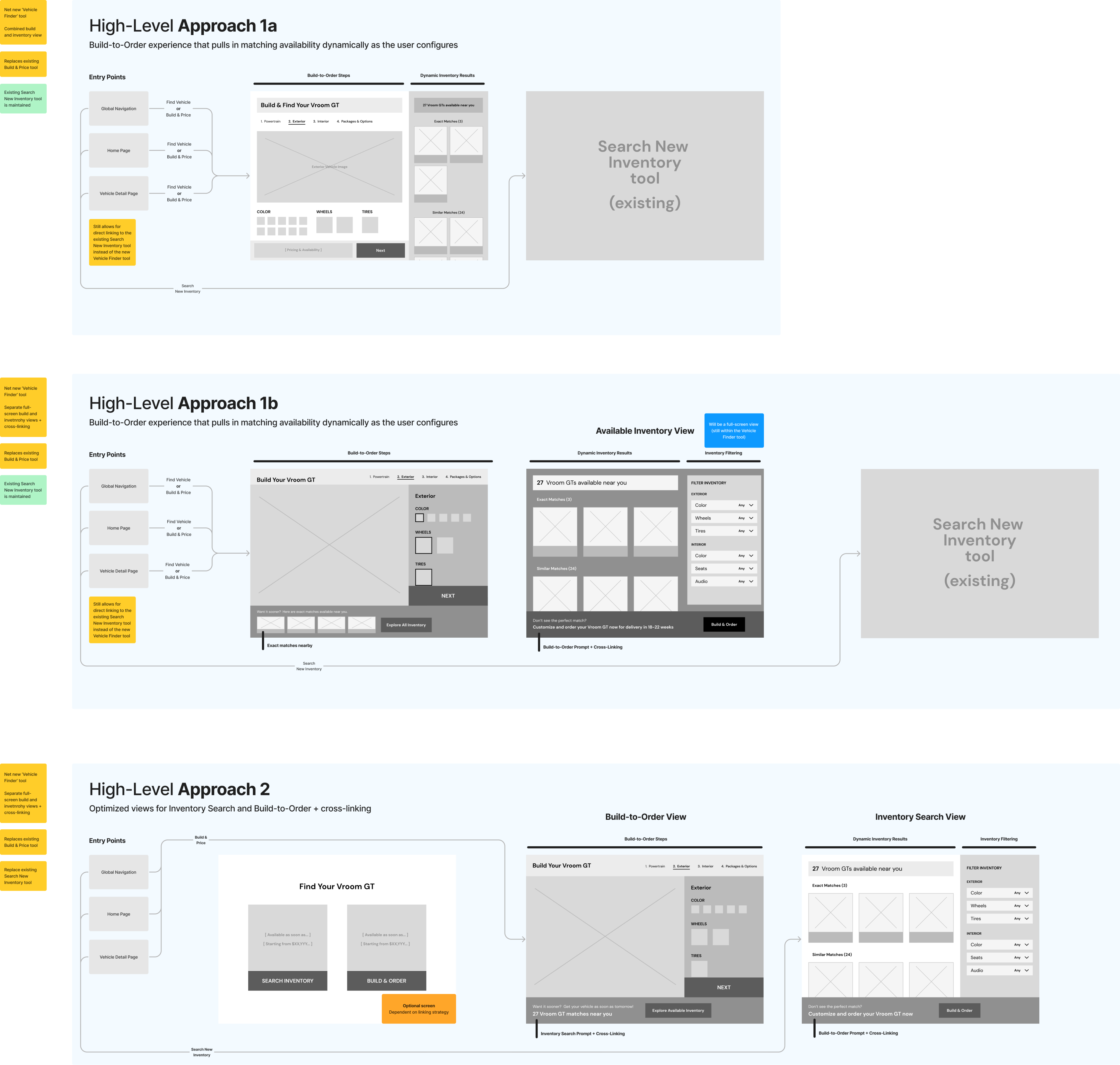
The Vehicle Finder needed to support two fundamentally different purchase decisions, each with its own downstream requirements, timelines, and emotional stakes. The checkout flow we designed created a single, unified entry point that branched cleanly into both paths.
For buyers who prioritize speed and simplicity over specific customizations.
For buyers who want a vehicle built to their exact specification from the factory.

The whole category assumed the buyer would do the hard work. We were designing to take that work away from them.
Every competitor required users to visit multiple pages, cross-reference separate tools, and manually reconcile availability with their desired configuration. Vehicle Finder was built on the premise that this was never the customer's job to do.
We developed three interaction models, each expressing a different philosophy for navigating a complex configuration. Making the alternatives tangible let us compare their behavior, trade-offs, and fit before committing to a direction.
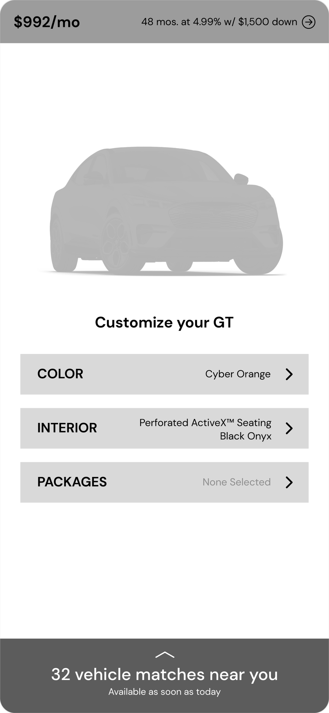
Defaults to a base configuration. Users can change attributes in any order, branching to dedicated sub-screens for each before returning to the hub to review their full build. Inventory matches update live on the hub screen.
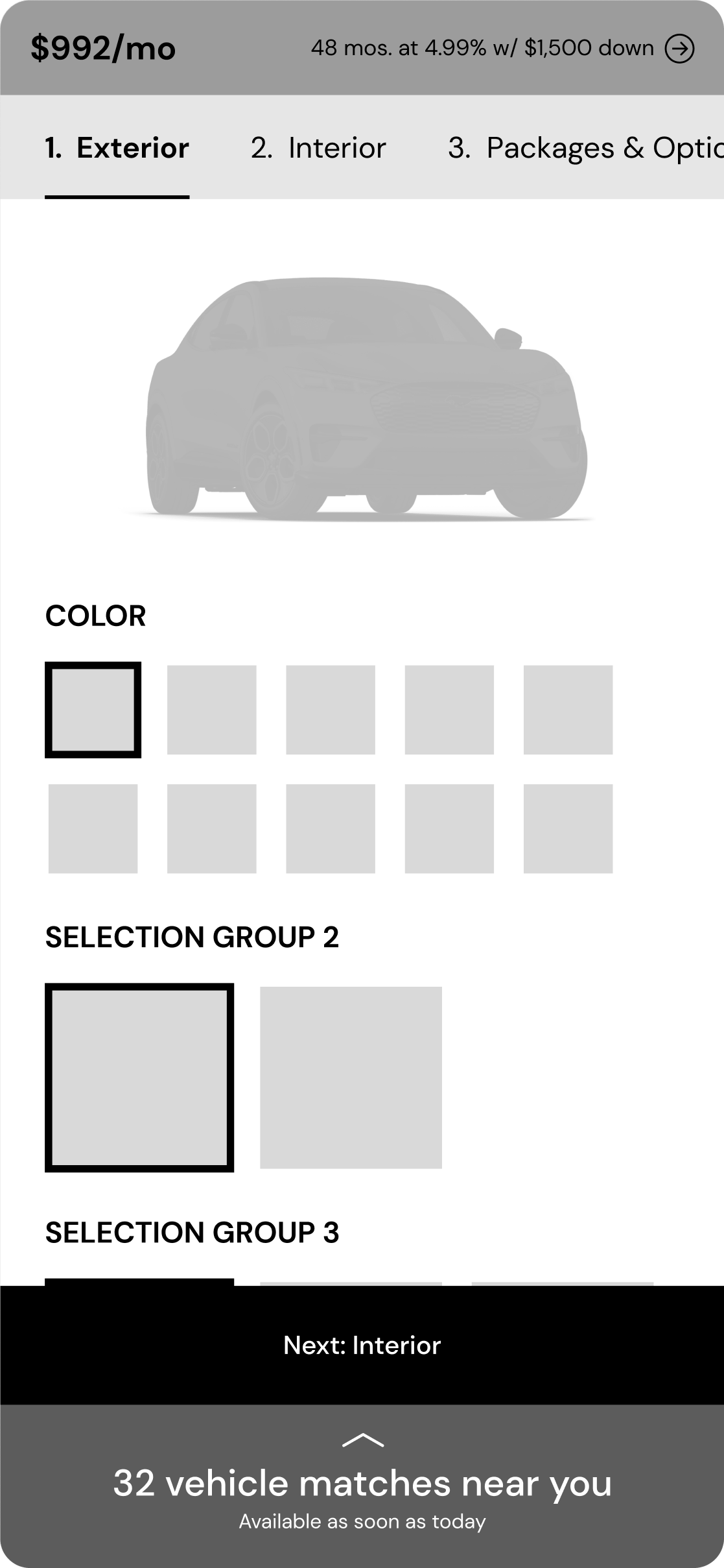
Takes the user through each configuration step in a fixed sequence: exterior, interior, packages, summary. Each step occupies its own screen, simplifying focus. The summary is the final step before branching to inventory or order.
All configuration sections are visible on a single scrollable page, with a summary panel anchored at the bottom or side. Users can jump between sections freely, with inventory results updating as they scroll.
We translated each interaction model into a working flow using representative Vehicle Finder content: vehicle imagery, color choices, package selection, and the live inventory match counter at the heart of the experience. These were not three cosmetic variations; they were distinct, testable hypotheses about how people want to build a car.
Phase 03
Taking one model of each philosophy to high fidelity, exploratory against guided, and letting 66 active EV shoppers pick the winner.
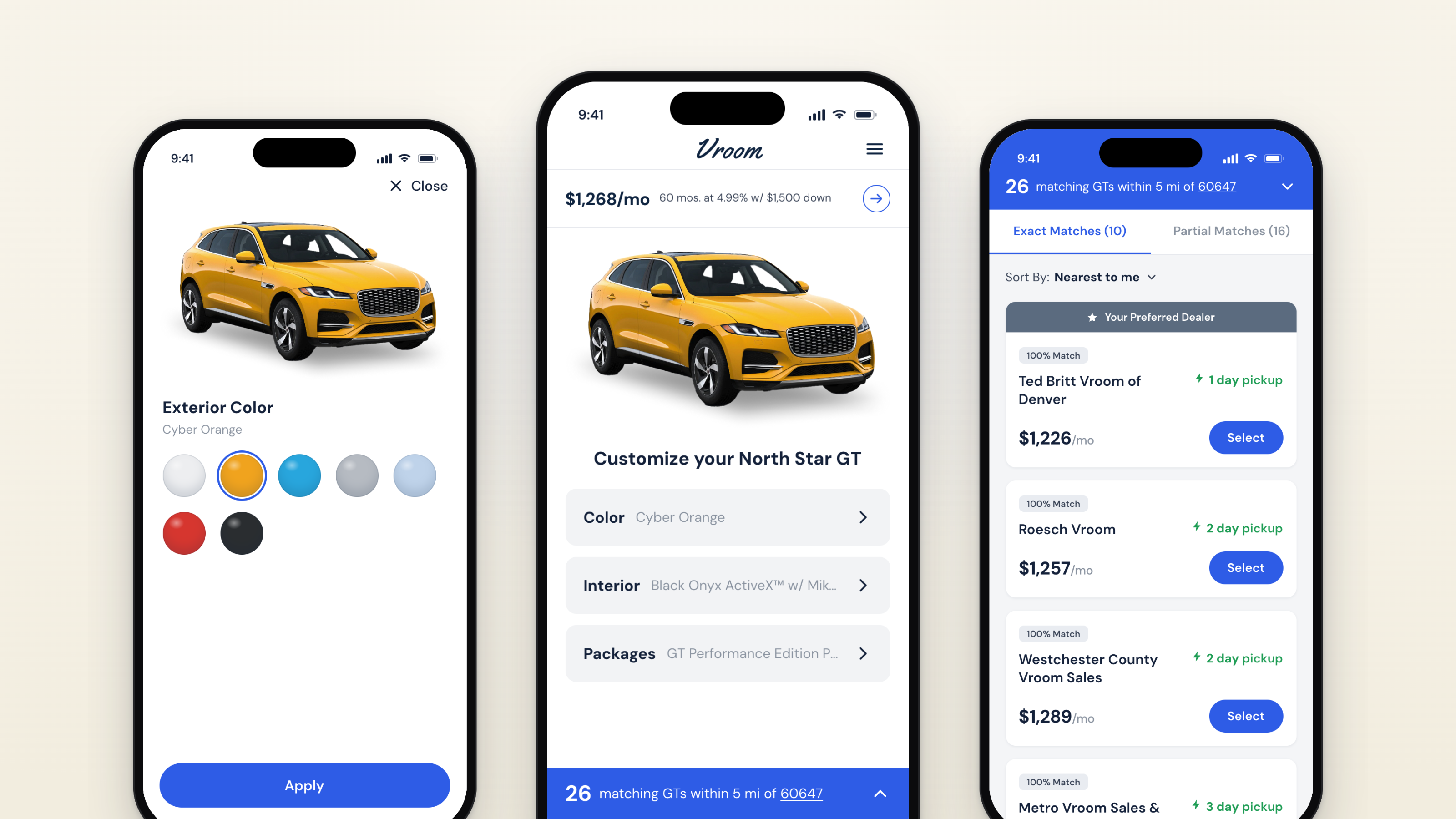
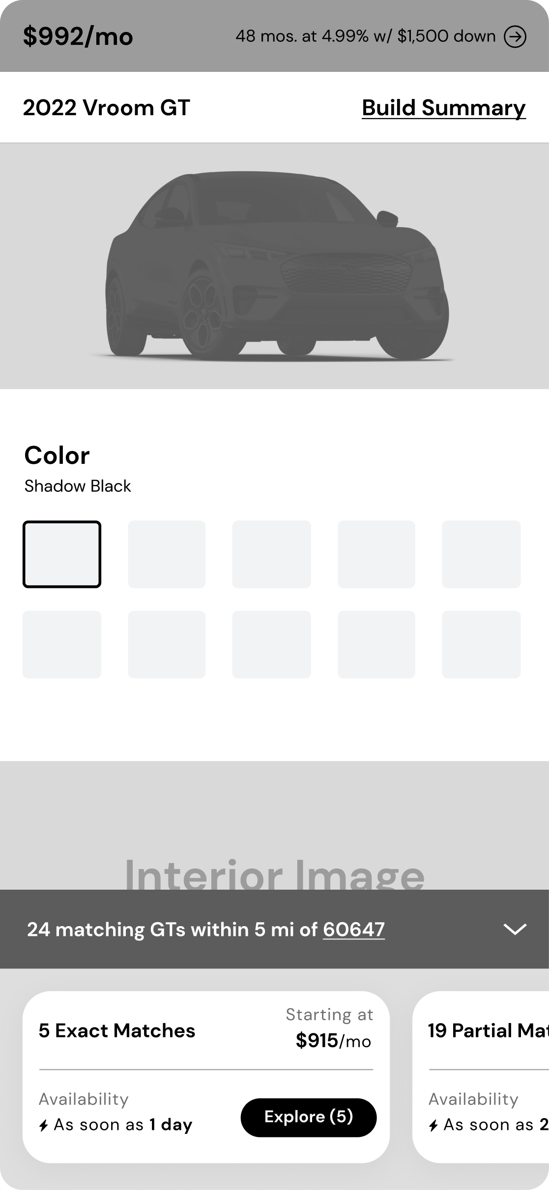
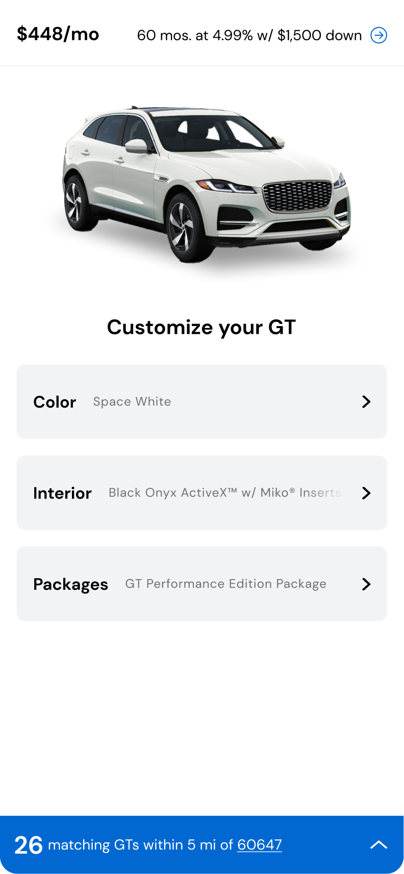
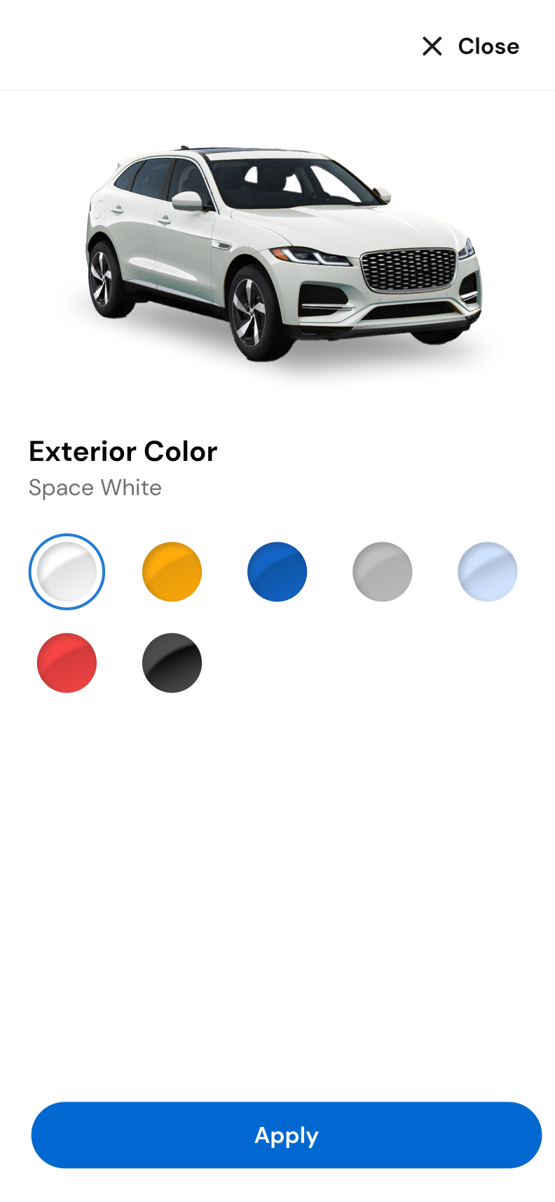
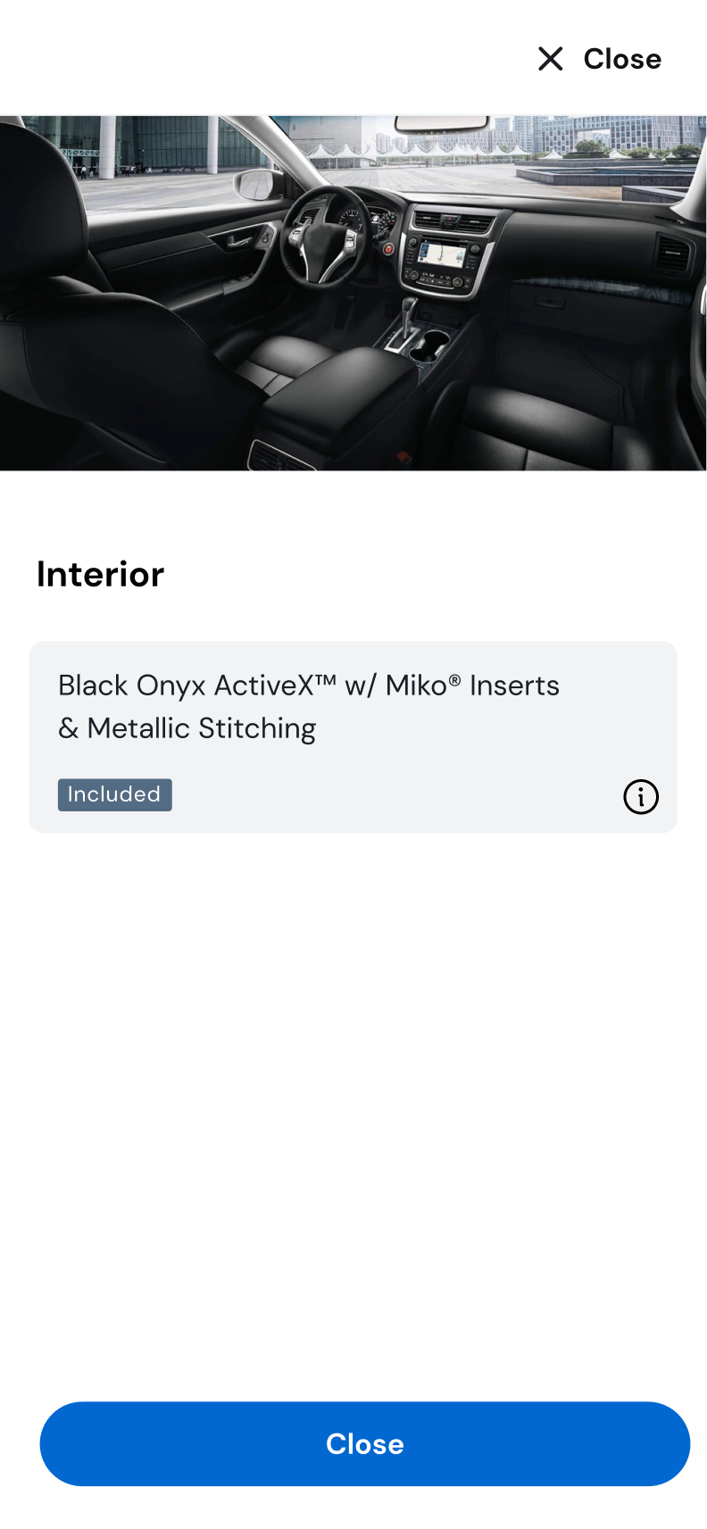
The first design direction brought the Hub & Spoke model to high fidelity. A central hub screen displayed the vehicle in its current configuration state: color swatch applied, interior and packages reflected in the image. Attribute selectors branched to dedicated sub-screens where users could compare options in full detail before committing.
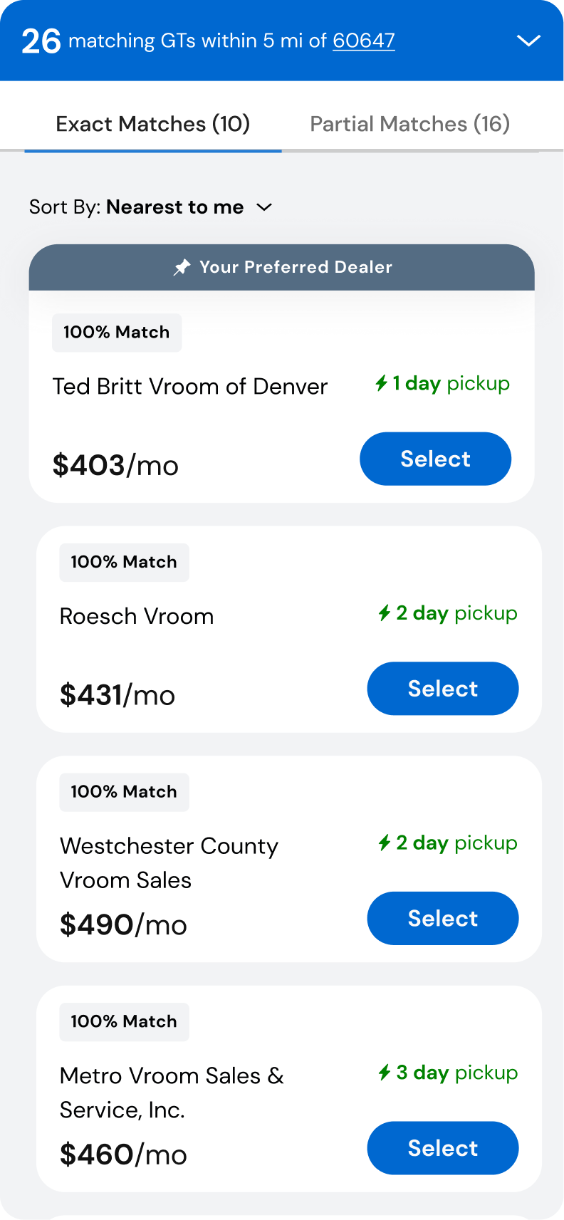
The critical addition: a persistent inventory counter at the bottom of every screen, showing exactly how many matching vehicles were available within the user's radius. Every selection immediately updated the count, making the inventory consequences of every choice visible and real, not something to discover later.
The second direction tested a fundamentally different hypothesis: what if users could see the full scope of their configuration choices at once, with an inventory panel that revealed matching vehicles as they scrolled and selected?
This approach favored comparison over commitment. Users could review all available options before making any selection, and the inventory drawer slid in from the side or bottom as results updated. It also introduced a side-by-side view, letting users compare their current and a modified configuration against each other before deciding.


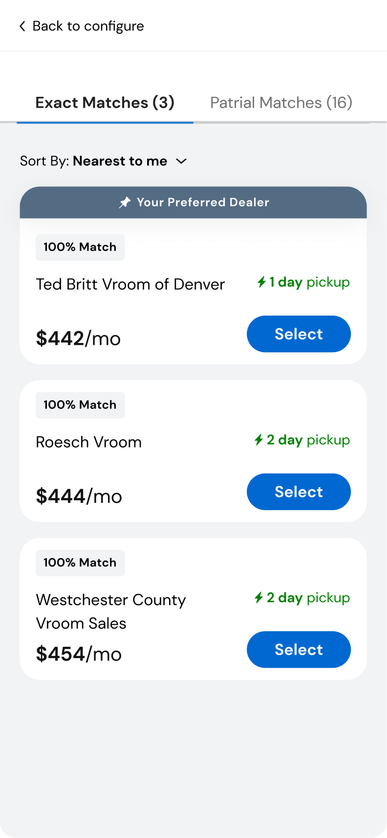
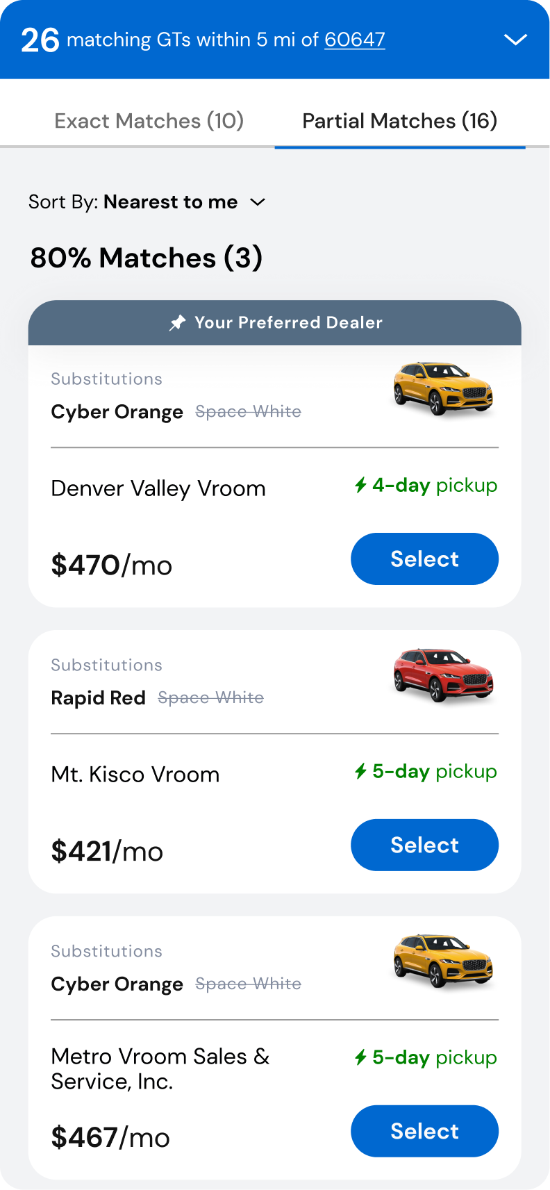
Both directions ended at the same moment of truth. The counter said 26 vehicles matched within five miles, the shopper tapped through, and during a supply shortage most of those 26 were not the exact car. The most common truthful answer was that the exact car wasn't there, and this screen had to turn that into 'here is how close you can get, and what it costs'.
The exact tab holds the shopper's precise build at nearby dealers: a '100% Match' badge on every card, the monthly payment, pickup measured in single days, and their preferred dealer pinned to the top. Sorted by distance, the only decision left is where and how soon.
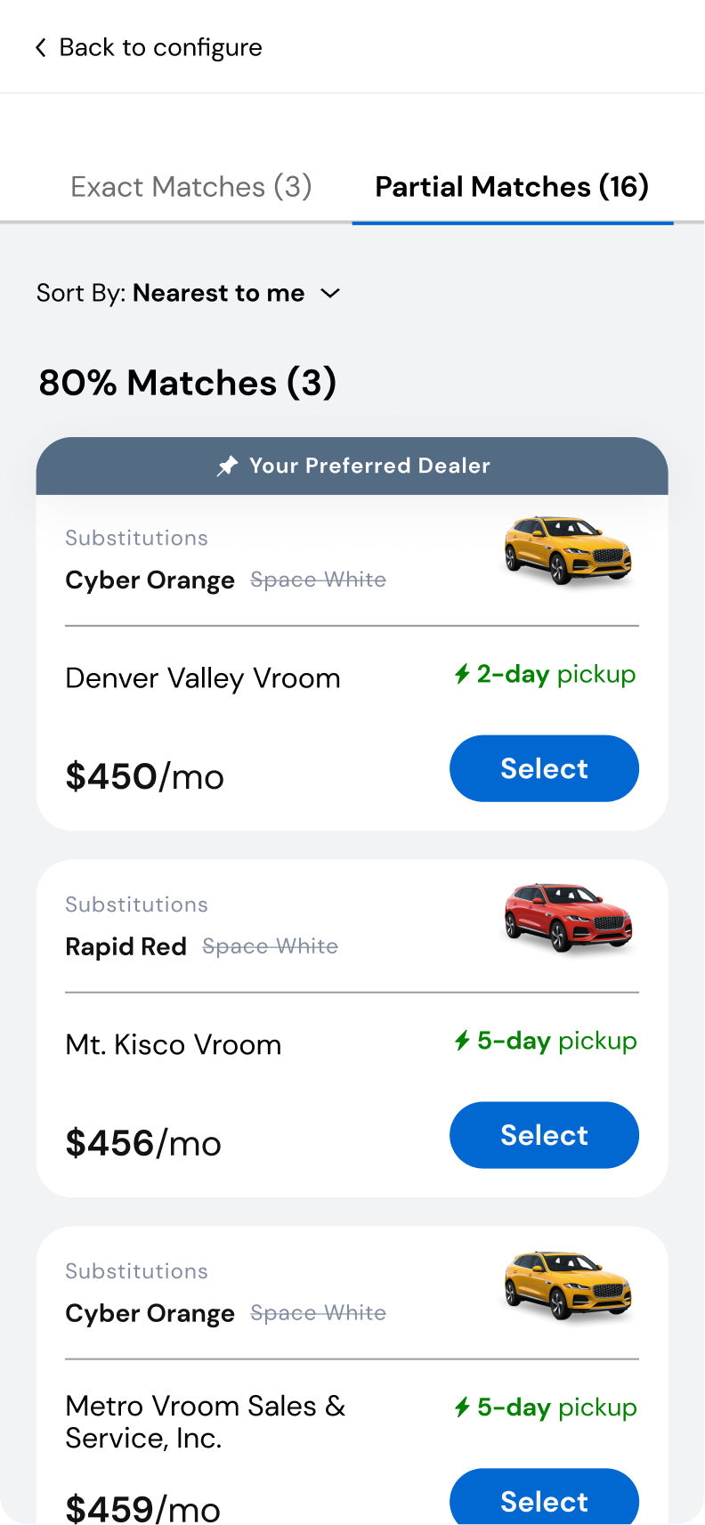
Partial matches are grouped into bands ('80% Matches') so closeness is scannable before a single card is read. Every card then leads with its substitutions: the option the shopper would actually get in bold, the one they asked for struck through beside it, and the vehicle re-rendered in the color that would really arrive. With the payment and pickup date on the same card, 'close enough' becomes a judgment made with the facts, not a discovery at the dealership.
The model traveled across both prototypes: behind the persistent counter in Hub & Spoke, and inside the inventory drawer and tray in Single Page Scroll. When testing later split on the tray, with preference and satisfaction pointing in opposite directions, the argument was never about the model itself. It was about how much of it to reveal before the shopper asked.
Stepped and Single Page Scroll shared the same guided philosophy, so the head-to-head that mattered put one model of each kind in front of 66 active EV shoppers in unmoderated sessions. Each person worked through real configuration scenarios in both prototypes, reviewed them side by side, and told us which was more useful, and why. Hub & Spoke won, 70% to 30%.
Hub & Spoke was preferred by 70% of shoppers, 46 of 66, with overall satisfaction of 4.7 out of 5. The revealing part is that they knew it took more taps and more screens to make the same selections, and chose it anyway. One put it plainly: "Yes, the other has fewer steps, but this way makes much more sense."
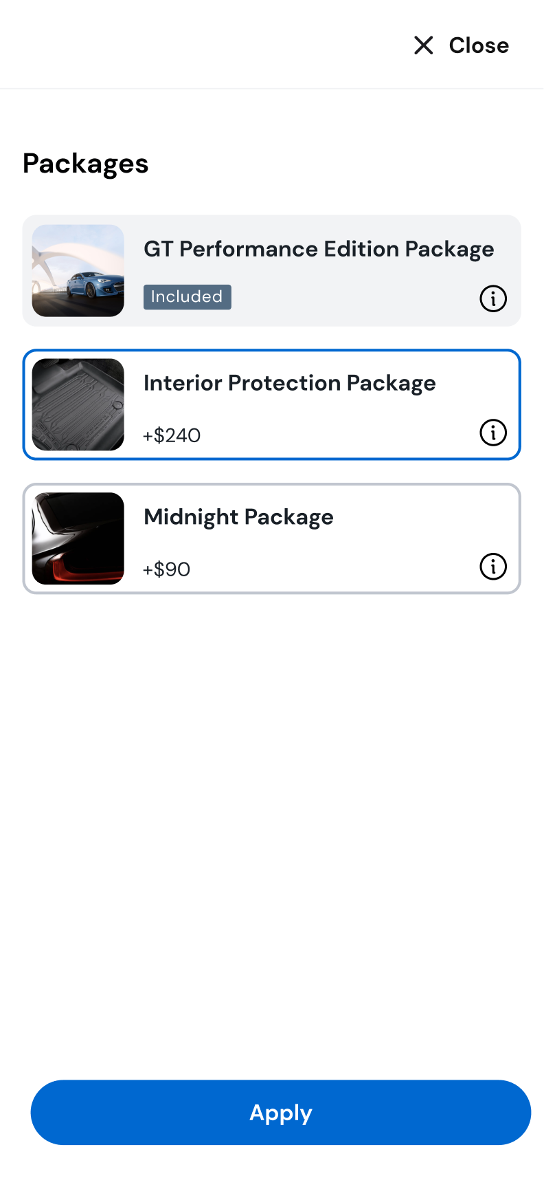
Packages sat in the middle of the Single Page Scroll layout, where shoppers struggled first to find them and then to tell whether they had actually made a selection. The Hub & Spoke 'Apply' step, one extra tap, turned out to be a confidence signal rather than friction.
Color selection was nearly a tie at 52% to 48%, with satisfaction identical at 4.7 apiece, since skipping the 'Apply' step made Single Page Scroll feel a step quicker. And in a separate comparison of the inventory tray, the partially-open version won on preference, 63% to 37%, while losing on satisfaction, 4.2 against the closed tray's 4.8: previewing nearby matches was appealing, and the horizontal scroll to browse them was not. That tray went back for rework.
Phase 04
A research-validated model selected for launch, and an honest lesson in the gap between UX readiness and business readiness.
Hub & Spoke was selected by the product and engineering team based on usability testing results, and shipped for the Ford Mustang Mach-E. Then the business reality arrived.
User Preference
Usability Testing · n=66
70%
Share of active EV shoppers who preferred Hub & Spoke over Single Page Scroll after completing the same scenarios in both prototypes, at 4.7 out of 5 satisfaction
Selected Model
Production Decision
Hub & Spoke
The interaction model chosen for development: validated by testing, endorsed by product and engineering, and scoped for the Mustang Mach-E launch
Build-to-Order
Scope at Launch
Deferred
Custom factory ordering was pulled from v1 at the last minute, since Ford was not yet ready to accept online orders or reservations. The tool still shipped fast, to keep from losing customers during the EV shortage
The Vehicle Finder launched with the inventory purchase path intact and build-to-order held for a later phase. The lesson: sometimes the right UX answer is ready before the business is. The gap between what users need and what an organization can operationally deliver is a design constraint too, and it rarely reveals itself on a screen.