Noah Pan

Enterprise workflow design for a 24/7 railyard

OrderProcessing

Norfolk Southern’s shipping clerks ran freight orders on a decades-old green-screen mainframe. Over a Fjord engagement, I led the design of a cloud-native concept to replace it: fast enough for clerks working full shifts, and clear enough to finally give supervisors a live view of the yard.

Role

UX Lead

Client

Norfolk Southern

Agency

Fjord

Platform

Enterprise web

When

2019 · cloud-native concept

Norfolk Southern Order Processing Platform: Today’s Shipments Dashboard

Today’s Shipments · Priority queue · Live status Terminal operating system · Web

The 60-second version

  1. The problem Freight orders ran on a green-screen mainframe: hundreds of memorized command codes, a punishing learning curve, and no live view for supervisors.
  2. My role Design lead, from field research and requirements through IA, wireframes, high-fidelity prototypes, and socializing it back to stakeholders.
  3. The approach One system with two modes: built for clerks clearing orders at speed and for the live oversight supervisors never had, all inside one architecture.
  4. The outcome A researched concept — field interviews, IA, and a high-fidelity prototype — handed to Norfolk Southern to build.
  5. The lesson For people who’ve spent years inside a system, ‘modern’ isn’t the win; ‘measurably easier than what they have now’ is. Every screen got judged against the green screen.
1

Modernizing a workflow that couldn’t go down.

Norfolk Southern runs one of North America’s largest freight networks. Its shipping clerks managed order processing on a mainframe that demanded hundreds of memorized command codes. The job wasn’t to reskin it. It was to answer a harder question: can you modernize a system that can’t go down, for people who already know it cold?

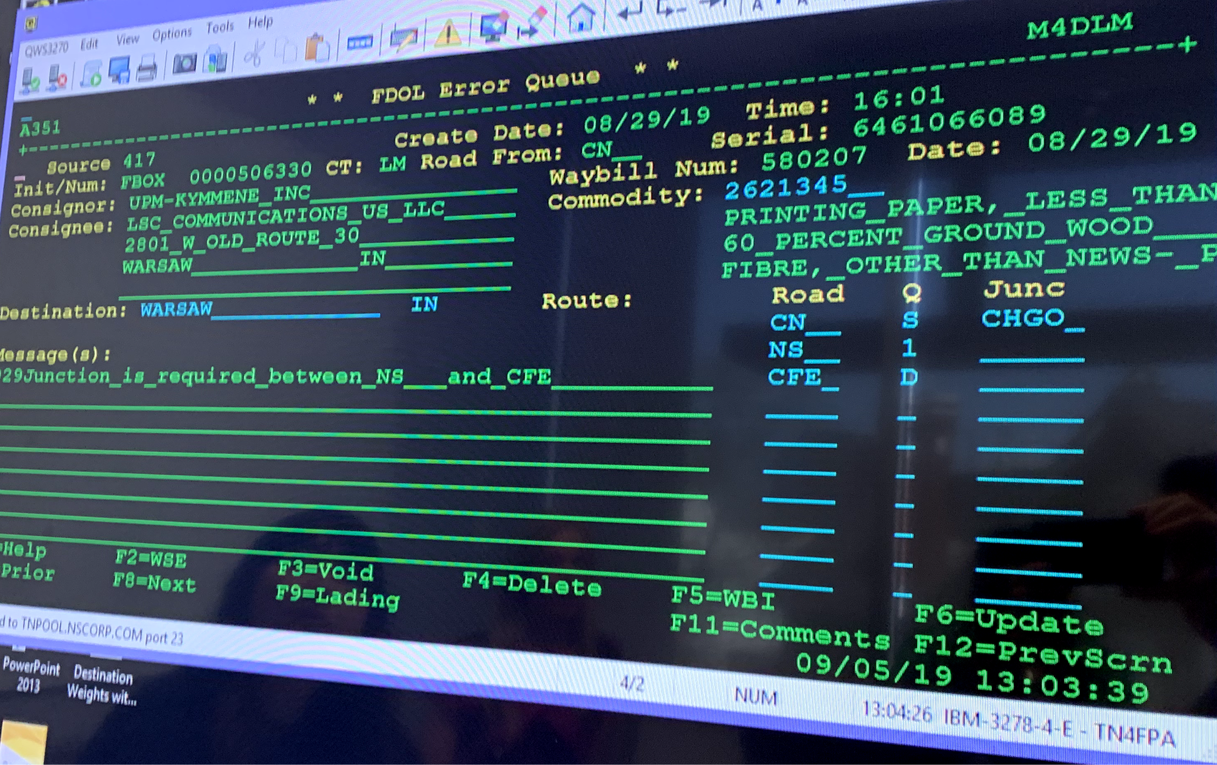
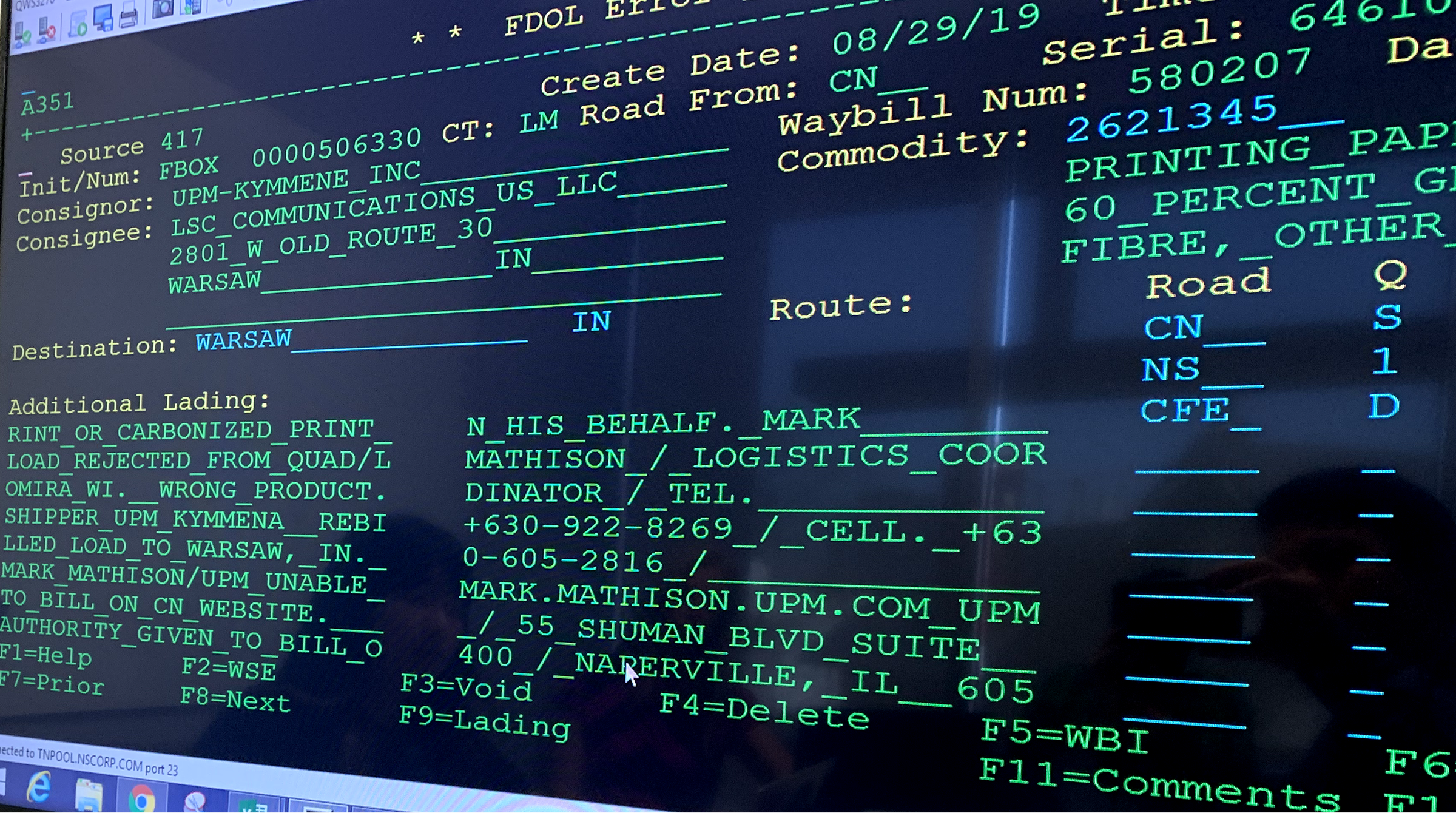
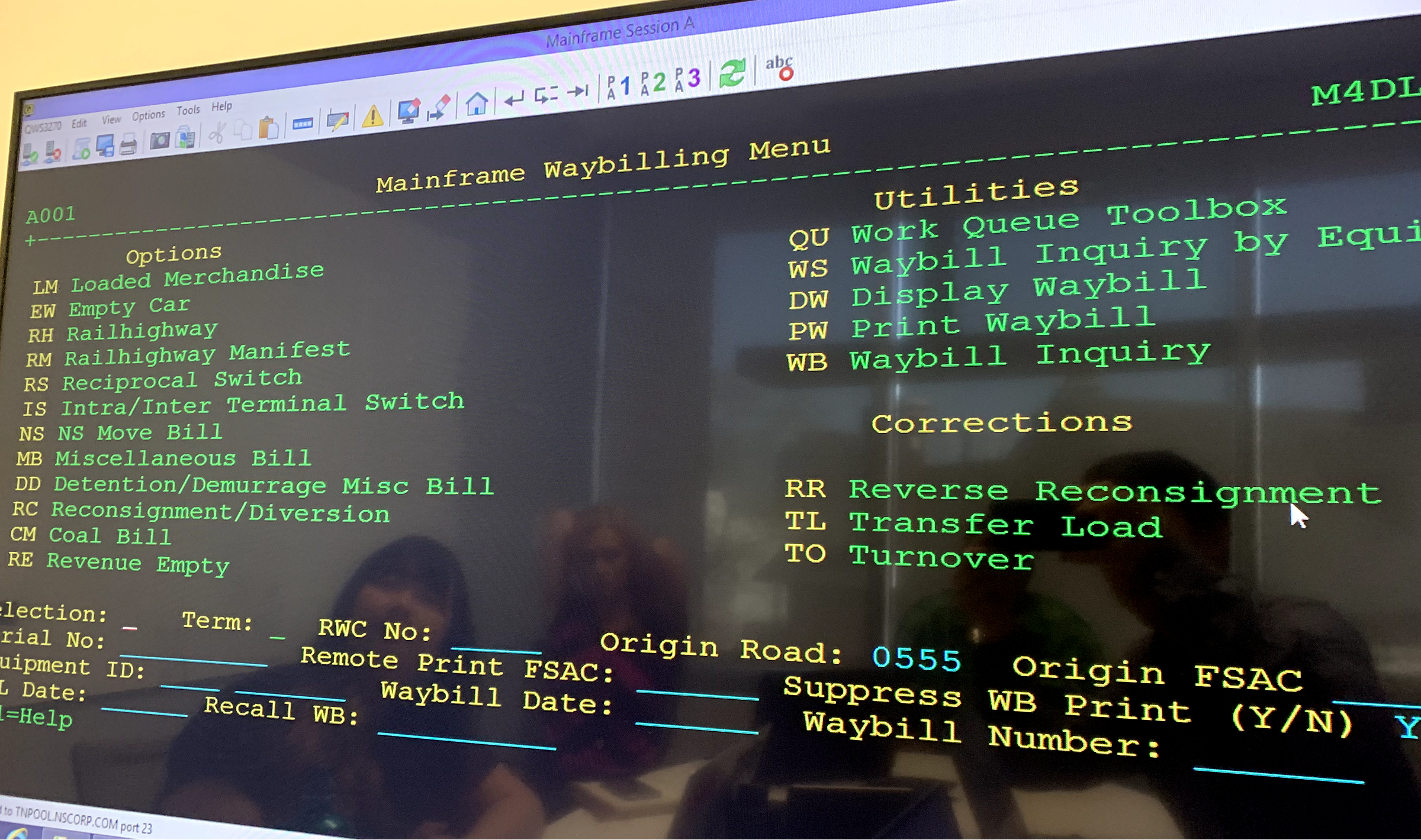
The green screen worked if you’d put in the years: dense fields with no hierarchy, ASCII navigation, function keys worn into muscle memory. It was fast in expert hands and merciless to everyone else, and the learning curve kept the knowledge locked in a handful of veterans.

Supervisors and executives needed something the terminal never gave them: a live read on order health, exceptions, and trends, not a report assembled by hand after the shift. Clerks needed the same speed without the memorized codes, and both had to live in one system.

The legacy

Green screens

Command-line terminals and function-key navigation: the operational backbone of a major railway, built for another era of computing.

Cryptic codes · months of training · no live oversight
The mandate

One modern system

Speed up order processing for clerks and give supervisors and executives a live operational view, from the same product, not a second reporting stack.

Faster order entry · live oversight · one product
The insight that drove every screen

The terminal hid the yard. The new system had to make the work visible.

Green screens stored freight as flat text and command sequences. Workers thought in physical reality: containers, exceptions, priorities, customers, time. The design job was to translate that ontology into a spatial interface, so clerks could act in the moment and leadership could see the aggregate without waiting on a spreadsheet.

1Make work clear

Hierarchy before density

The legacy failure wasn’t missing data. It was data without a primary job on each screen. Every screen needed a clear action path, with secondary detail available but not in your face.

Instead of packing every field into one terminal page and calling that ‘complete.’

2Earn trust

Measurably easier than the green screen

These weren’t casual users. Unionized clerks spent full 8-hour shifts in the terminal, many with years or decades of muscle memory in it. They’d be trained on whatever replaced it, so the bar wasn’t ‘easy for a first-timer,’ it was ‘faster than what they already do without thinking,’ with the training cut way down.

Instead of a modern coat of paint that ignores how much expertise already lives in the room.

2

Two realities in one railyard.

Discovery meant bridging the tower and the boardroom. Clerks needed speed under pressure. Supervisors needed signal without waiting on manual reports. Basic questions stayed open: What’s blocked right now? and Who can see it in time?

Landscape audit

We studied the current terminal state in the field, and looked outside rail to SaaS products that already help knowledge workers prioritize and clear high-volume work. Three gaps kept showing up.

Work without a visible queue

Terminals buried priority inside command sequences. Nothing felt like a triage queue.

Oversight arrived late

Leadership reconstructed KPIs from delayed reports. Live exceptions stayed invisible upstairs.

Training as a gate

Hundreds of codes made competence a multi-year investment. New hires paid for the system’s age.

The current state · legacy terminals

Legacy terminal interface showing waybill data entry Legacy terminal interface showing order processing screen Legacy terminal interface showing route and commodity fields

How might we give terminal workers real-time visibility into container logistics, and cut the cognitive load of managing complex freight transfers?

Status quo vs. what we designed

Those gaps set the contrast: replace cryptic command density with scannable work, and give supervisors a live read without a second reporting stack.

Status quo

Work stayed hidden and truth arrived late

Clerks navigate by memory. Supervisors wait on assembled reports. The yard’s state exists, but not as a shared, timely picture.

Function keys · ASCII density · spreadsheet rollups
Ours

Visible queues with live oversight

Clerks clear prioritized work on modern screens. Executives watch KPIs and exceptions while operations are still in motion.

Today’s queue · order detail · executive report

Two mindsets

Research required different methods for each group, because they needed different truths from the same platform.

Target A

Shipping clerks

  1. What needs action on my queue right now?
  2. Can I finish this without hunting codes?
  3. Will a mistake be obvious before it ships?

Target B

Supervisors & executives

  1. Where are exceptions forming today?
  2. What trends need a decision this week?
  3. Can I see this without waiting on a manual report?

Into the work environment

Clerks were observed on live terminals under real conditions. Supervisors and executives sat for structured interviews about the information they needed and could not get.

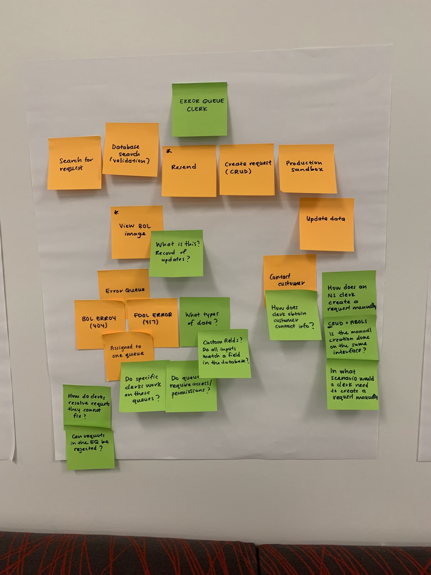
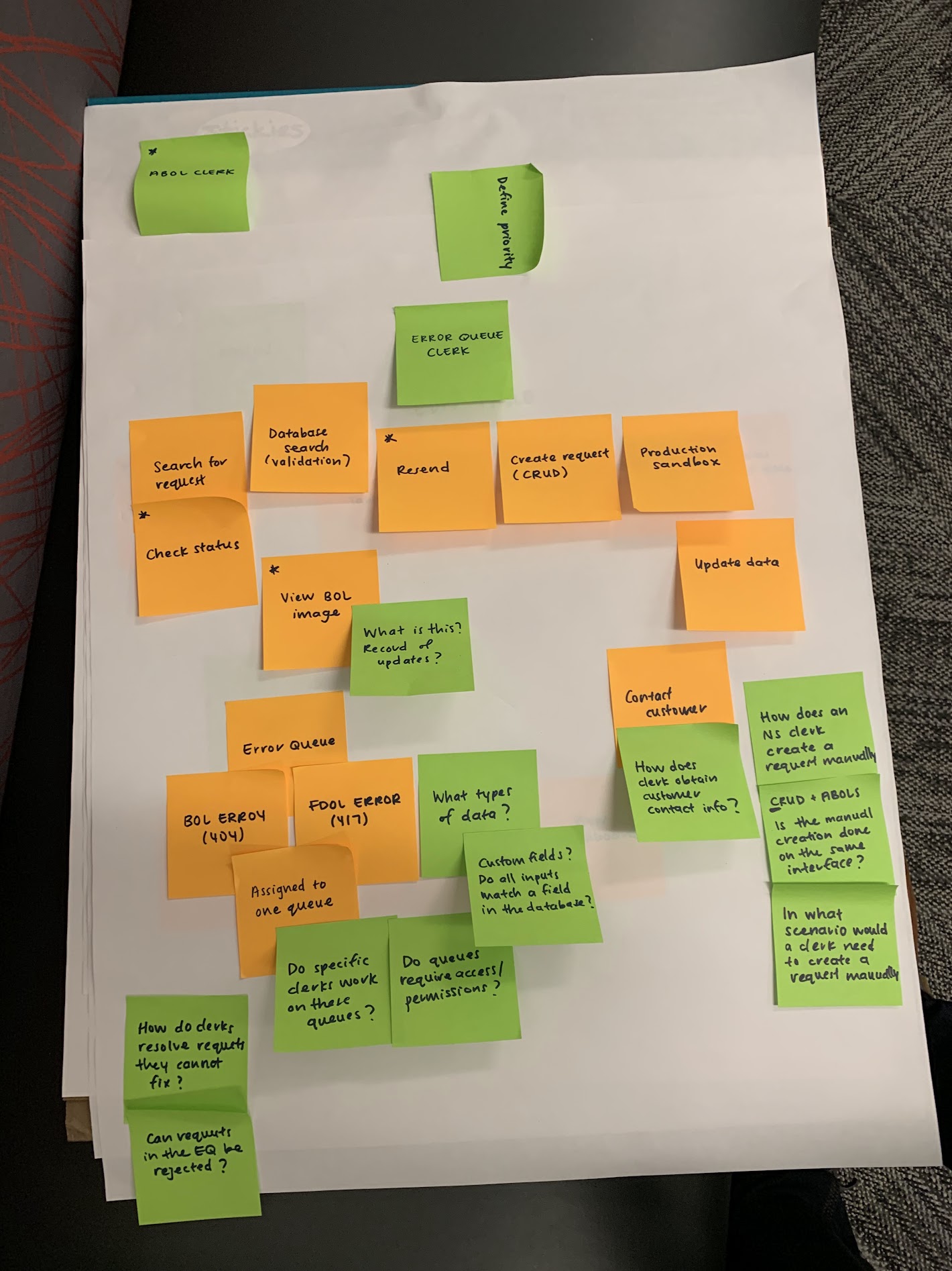
Workshop affinity map centered on Error Queue Clerk workflows
Error queue lens Orange notes traced lookup through validation. Green notes held open questions on permissions, manual CRUD, and customer contact.
Workshop board with ABOL Clerk and Error Queue lanes
Multiple clerk realities ABOL and Error Queue lanes stayed in one workspace so priorities couldn’t collapse into a generic operator.

These clerks had operated green screens for decades. We had to earn their trust by making the job genuinely easier.

Previous pattern · Mainframe terminals · Institutional knowledge as gatekeeping

3

Structure before screens. Principles before polish.

Other railway tools shared the same legacy problems. We looked outside the industry to SaaS products that already help people manage, prioritize, and finish high-volume work with clarity.

Ticketing systems

Zendesk-style queues showed how to treat flagged shipments like tickets: status, priority, and a clear next action.

CRM platforms

Relationship history in one view translated into a shipment lifecycle in one place, not scattered across terminal screens.

Task management

Priority and recency at a glance informed Today’s Shipments: what needs attention now versus what can wait.

Design principles

Four rules, drawn from constraints and research, revisited at every review so polish never outran the mandate.

Principle 1

Clarity over density

Every screen has a primary job. Secondary information stays accessible without competing for attention.

Principle 2

Earn confidence

Zero tolerance for ambiguous states or unfamiliar interactions without payoff. Trust beats novelty.

Principle 3

One system with two modes

Clerks and executives stay fully supported: distinct experiences, unified architecture.

Principle 4

Cut the training curve

Borrow patterns clerks have seen elsewhere (tables, forms, dashboard tiles), so getting productive doesn’t mean relearning railway-only conventions from scratch.

Information architecture

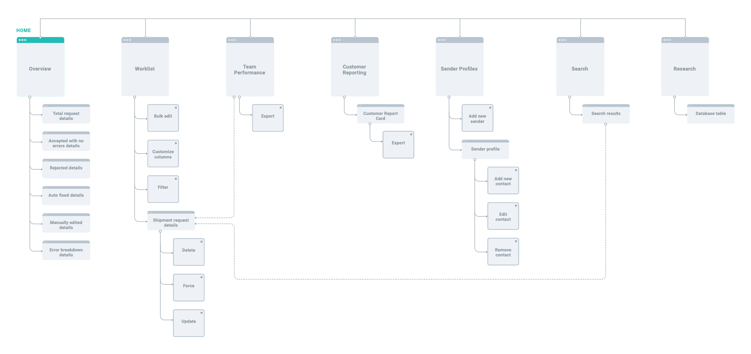
Before screen design, a site map made the separation explicit: clerks moving between individual orders, supervisors scanning aggregates, same product.

Platform site map showing clerk and supervisor navigation branches

Site map. Primary navigation branching into clerk workflows and supervisor reporting without forcing one mode onto the other.

Concept wireframes

Four screens covered both user types before visual design: operational dashboard, order queue, shipment form, and reporting.

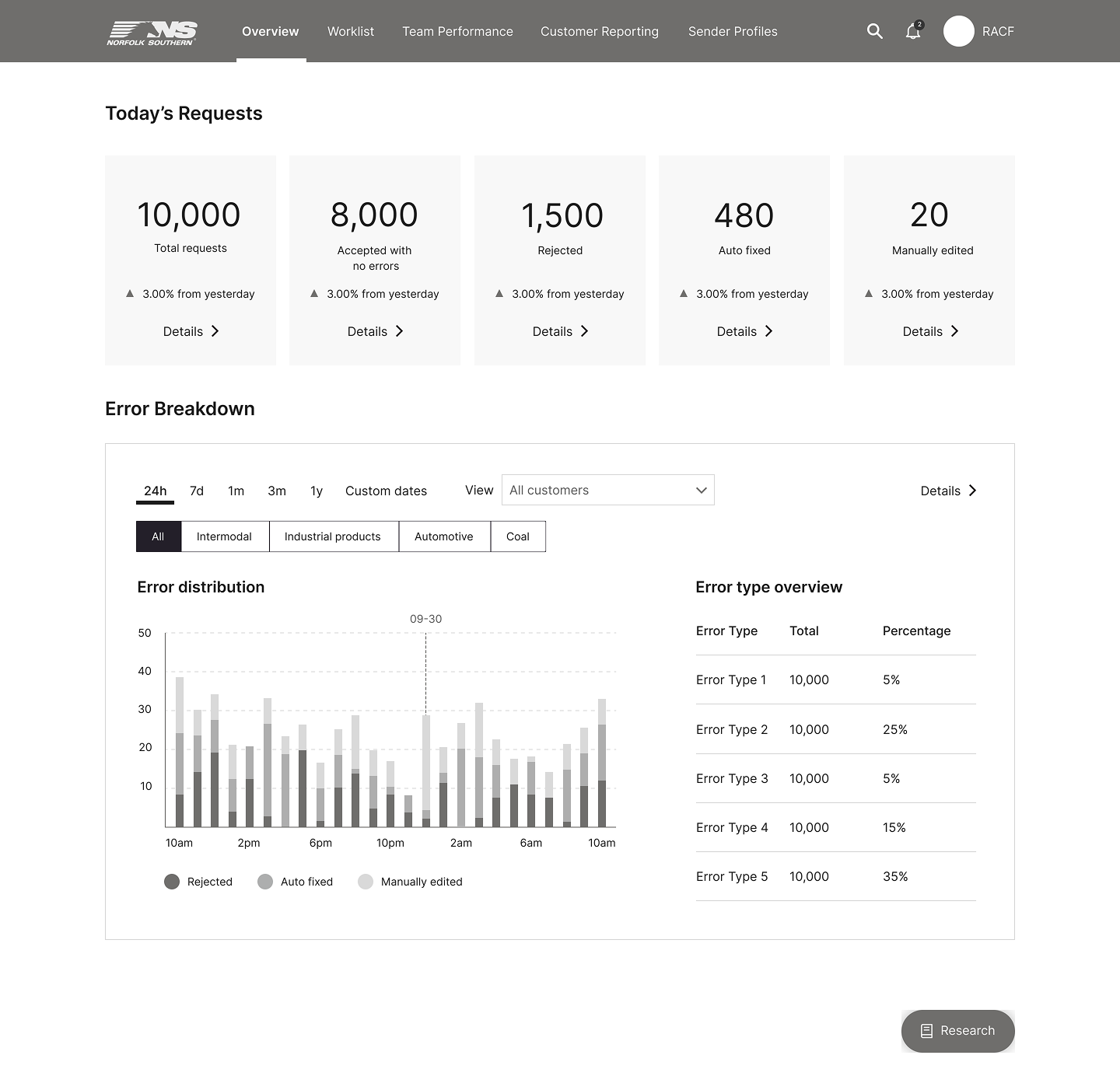
Today’s Dashboard wireframe

Today’s Dashboard

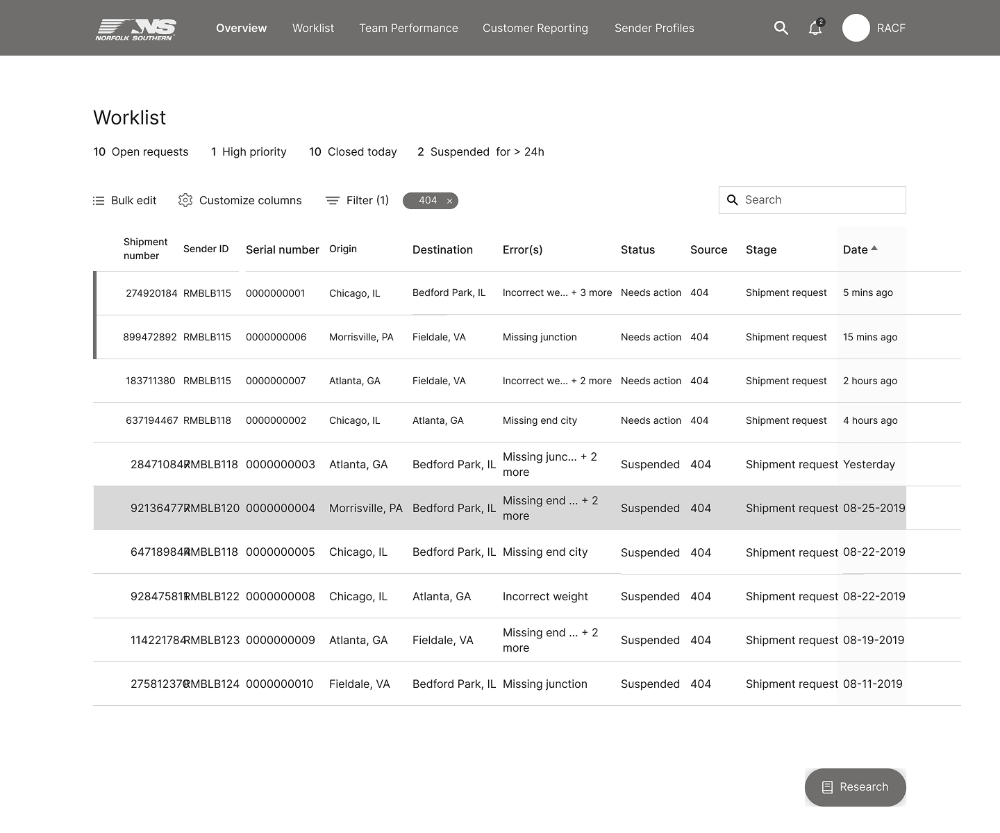
Order Queue wireframe

Order Queue

Shipment Entry Form wireframe

Shipment Entry Form

Reports View wireframe

Reports View

4

We designed inside hard lines.

Limited system integration

The platform could not pull from the additional 12+ research databases clerks used daily. Improvements had to work inside real data limits.

Design for meaningful gains with the data we could reach, not a fantasy of total integration.

Cut training time, without dumbing it down

These were career operators: unionized clerks in the green screen for full shifts, many for years. New hires still had to ramp fast, and everyone would get trained, but the point was to cut that training way down from what the terminal demanded.

Keep the depth power users lean on; lose the months-long learning curve. Familiar SaaS patterns over railway-only convention.

5

Clarity and density, finally in the right order.

High fidelity kept the data richness clerks need, but put hierarchy first. A dark NS header anchored navigation. Teal visualization made charts readable. White space, a deliberate reversal of the terminal, gave the work room to breathe.

Dashboard

Lead with today’s priorities

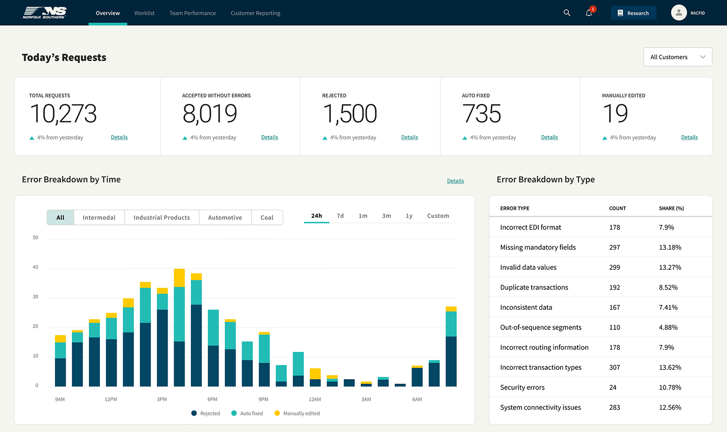
Today’s Shipments surfaces what needs action now. Priority and status read at a glance, so the first screen is a triage tool, not a blank command line.

Orders

Tables built for scan speed

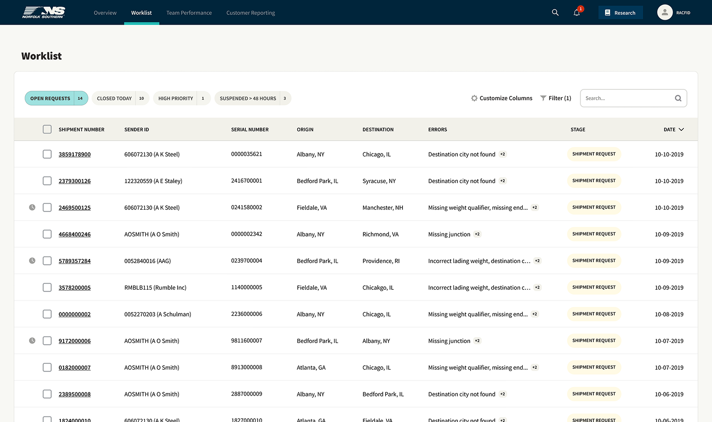
Order management borrows SaaS list patterns clerks already know: filter, sort, open, act. Density stays high; hierarchy stays honest.

Entry

Forms that reduce error

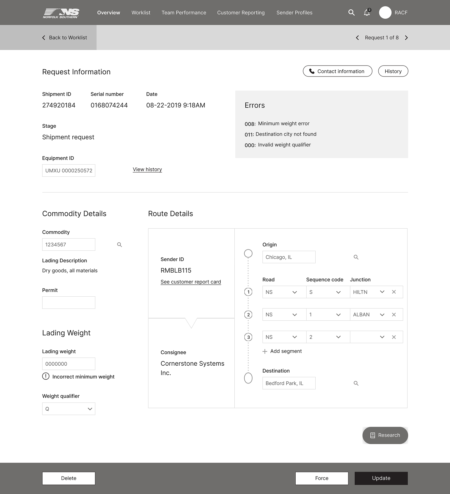
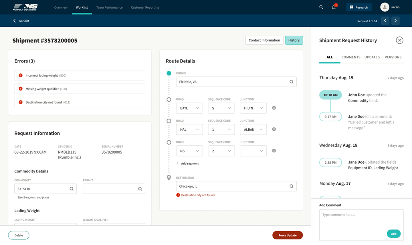
Shipment entry replaces cryptic sequences with guided fields and clear validation, including edge cases like hazmat and live refrigeration status.

Reports

Live executive signal

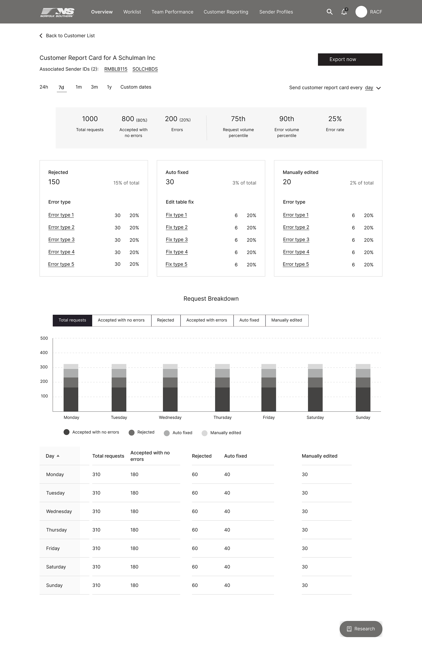
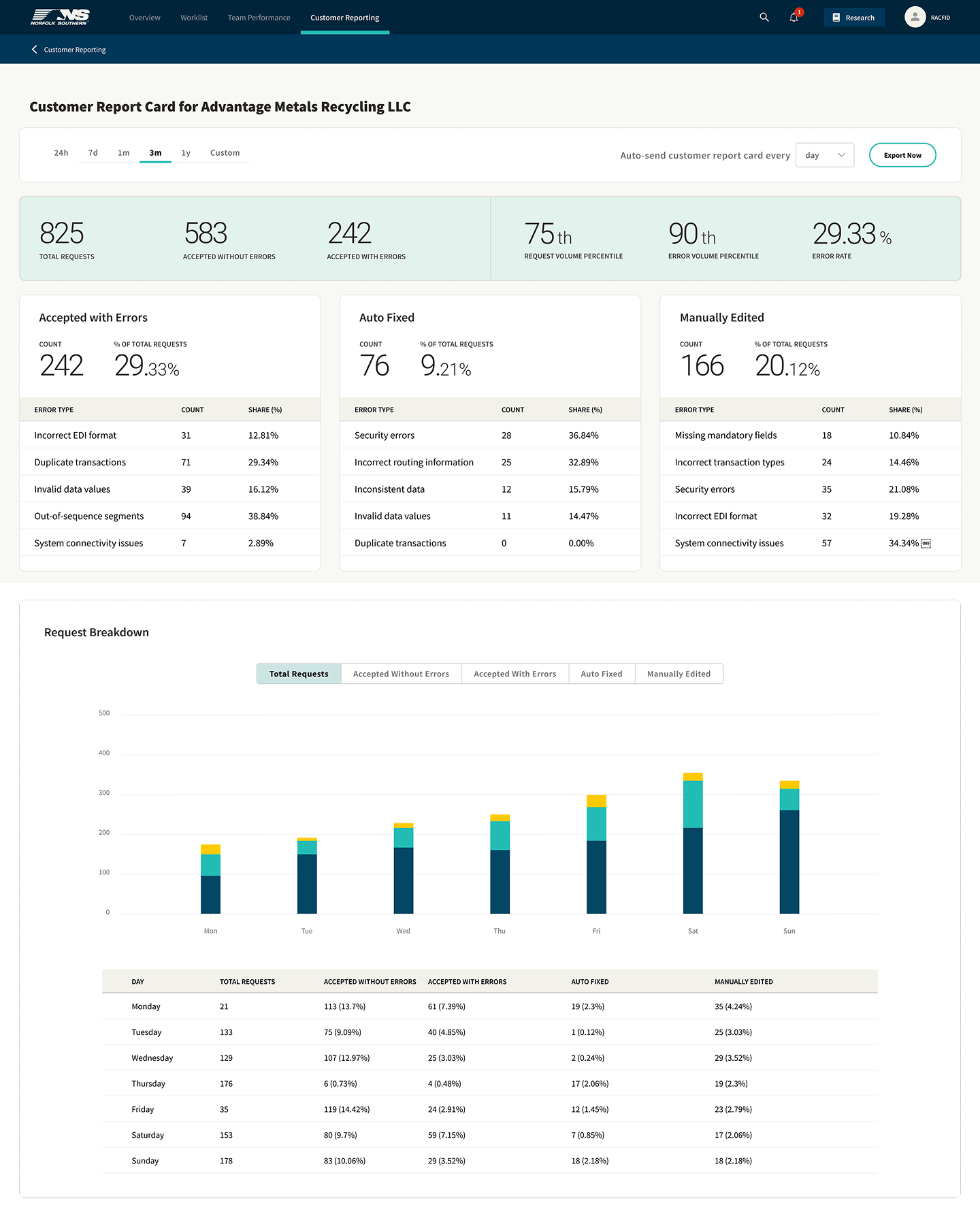
Customer and operational reports give supervisors trends and exceptions without assembling the picture by hand after the shift.

From sketch to structure

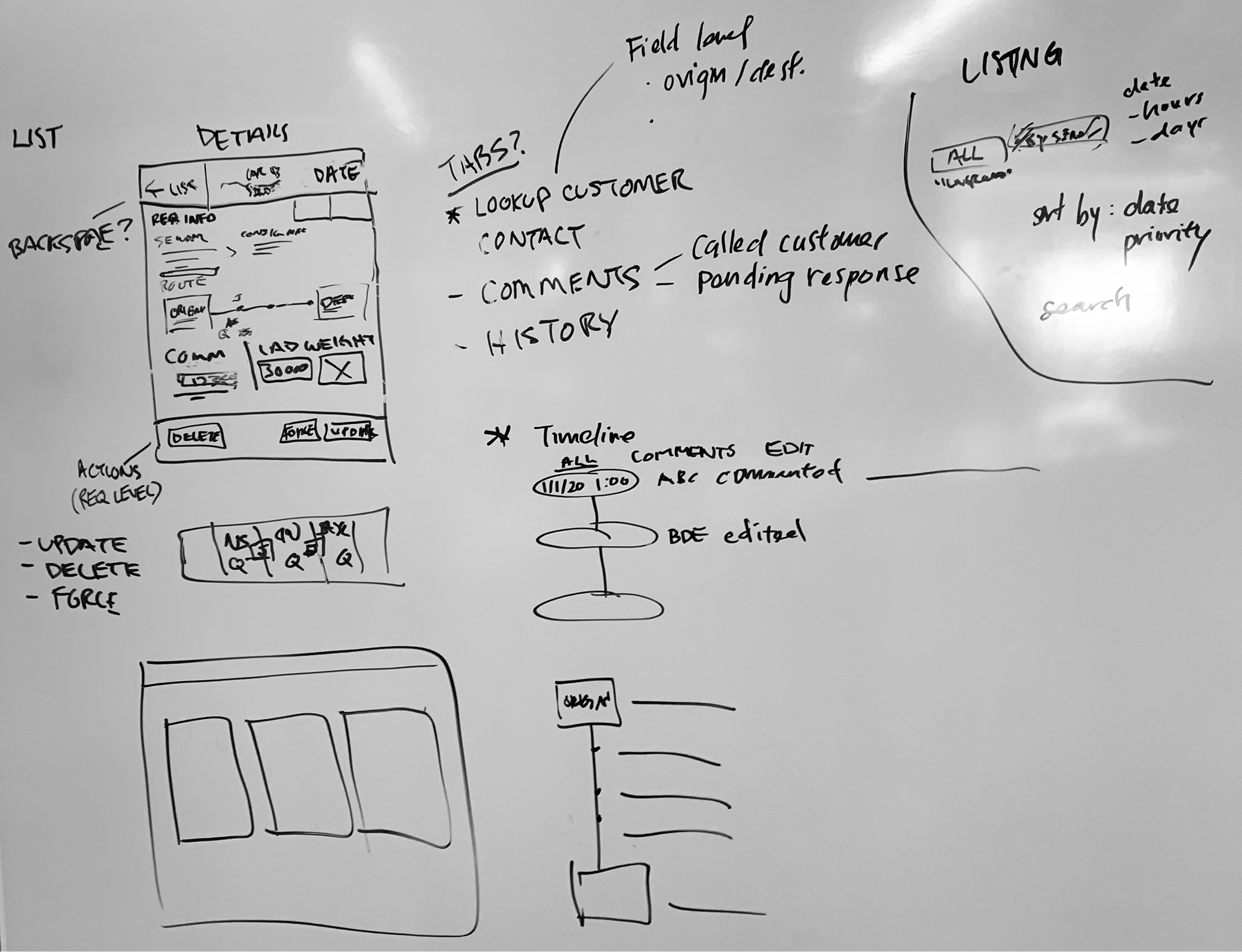
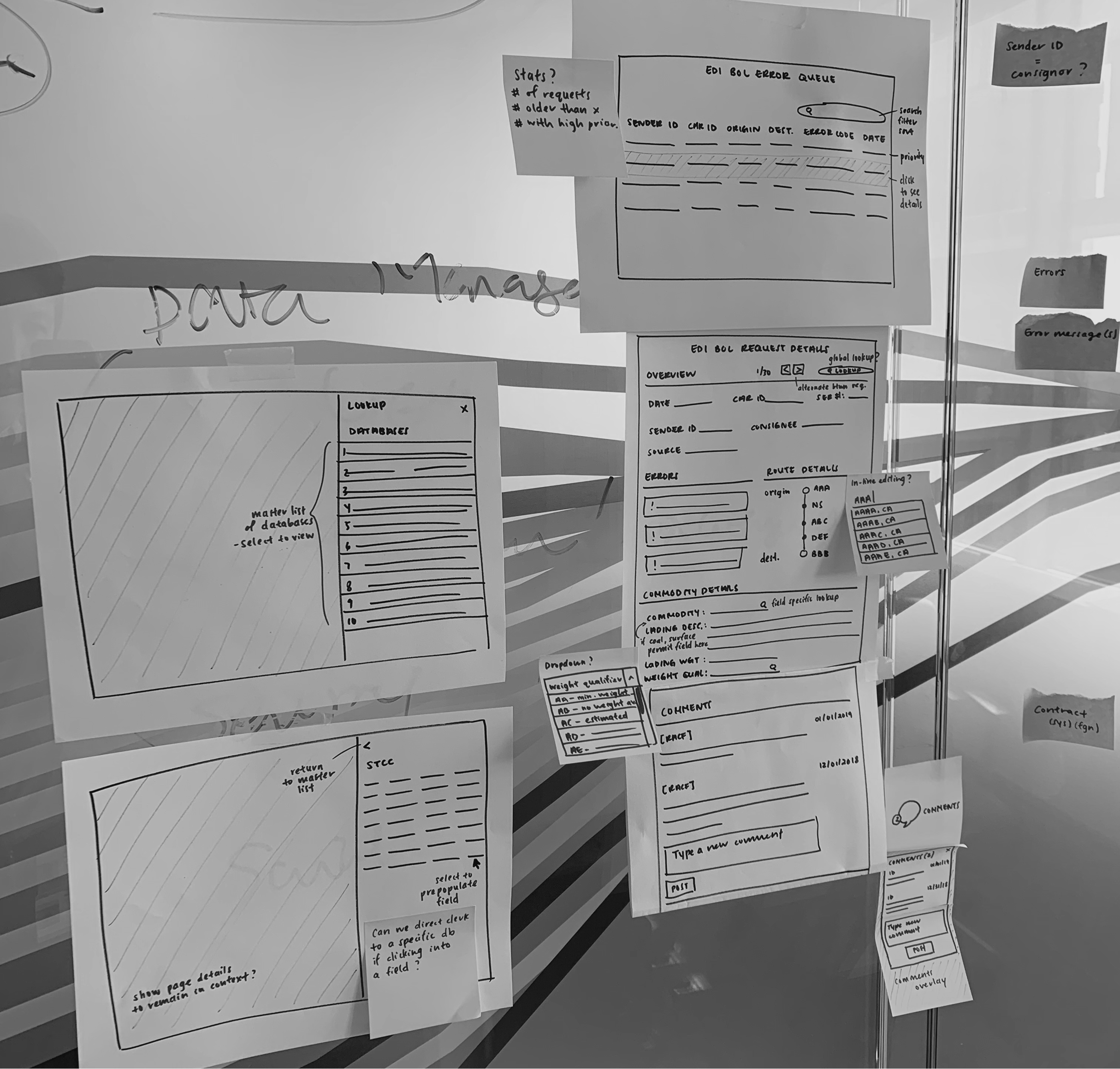
Early ideation mapped the railyard’s ontology onto spatial layouts before visual design locked the brand language.

Concept sketch whiteboard explorations
Whiteboard flows Early explorations of navigation and screen relationships.
Paper wireframe layout explorations
Paper wireframes Layout density tests before committing to high fidelity.

High-fidelity screens

Dashboard · For clerks Today’s Shipments Dashboard
Today’s work, ordered: a priority-aware queue replaces ‘what do I type next?’ with work you can scan and clear.
Orders · For clerks Order Management Table
Scan, prioritize, act: tabular queues borrow SaaS patterns clerks already understand, meant to cut the training load without giving up the density they work fast in.
Entry · For clerks Shipment Entry Form
Guided shipment entry with clear validation, including edge cases like hazmat and live refrigeration status.
Reports · For leadership Executive Customer Report
Signal without the wait: KPIs and exceptions stay visible while work is moving, not rebuilt from spreadsheets later.

The bar for modernization

‘Measurably easier.’

Looking modern wasn’t enough. Every interaction had to be simpler, faster, or easier to understand than its terminal equivalent, or veterans would never leave the green screen.

Outcome · Concept · handed off at design

Where it was built to land.

A Fjord engagement, researched and designed end to end, then handed to Norfolk Southern to build.

Metrics the design was built to move:

Shipping clerks

Ramp time

The terminal took months to learn. Built on patterns clerks already know, the bet is a new hire productive in days, the first number Norfolk Southern can watch.

Key bet

Order accuracy

Error rate

Guided entry and inline validation exist to catch what the green screen let through. Track corrected-after-submit rate against the old baseline.

Supervisors & executives

Time to signal

Live dashboards replace reports built by hand. Measure how fast leadership sees an exception now versus the old spreadsheet lag.

The reframe: for people who’ve lived in a system for years, ‘modern’ was never the goal; ‘measurably easier than what they’ve got’ was. Every screen got judged against the green screen.

Next Project

GEO Content Marketplace

PartnerStack